
REVIVAL CHRISTIAN CHURCH BRAND SYSTEM
Brand Identity, Environmental Graphics, Presentation Design, Apparel Design
Brand Identity, Environmental Graphics, Presentation Design, Apparel Design
This project establishes a cohesive identity system for Revival Christian Church and its youth ministry, designed to create visual consistency and tell a powerful story across both digital and physical environments. The identity originates with the Revival Youth logo, which later informed the development of the primary church mark. This project demonstrates my ability to translate a carefully constructed mark into a flexible identity system that functions across digital media, environmental spaces, and apparel while strengthening recognition and community connection.
This project establishes a cohesive identity system for Revival Christian Church and its youth ministry, designed to create visual consistency and tell a powerful story across both digital and physical environments. The identity originates with the Revival Youth logo, which later informed the development of the primary church mark. This project demonstrates my ability to translate a carefully constructed mark into a flexible identity system that functions across digital media, environmental spaces, and apparel while strengthening recognition and community connection.
The Process
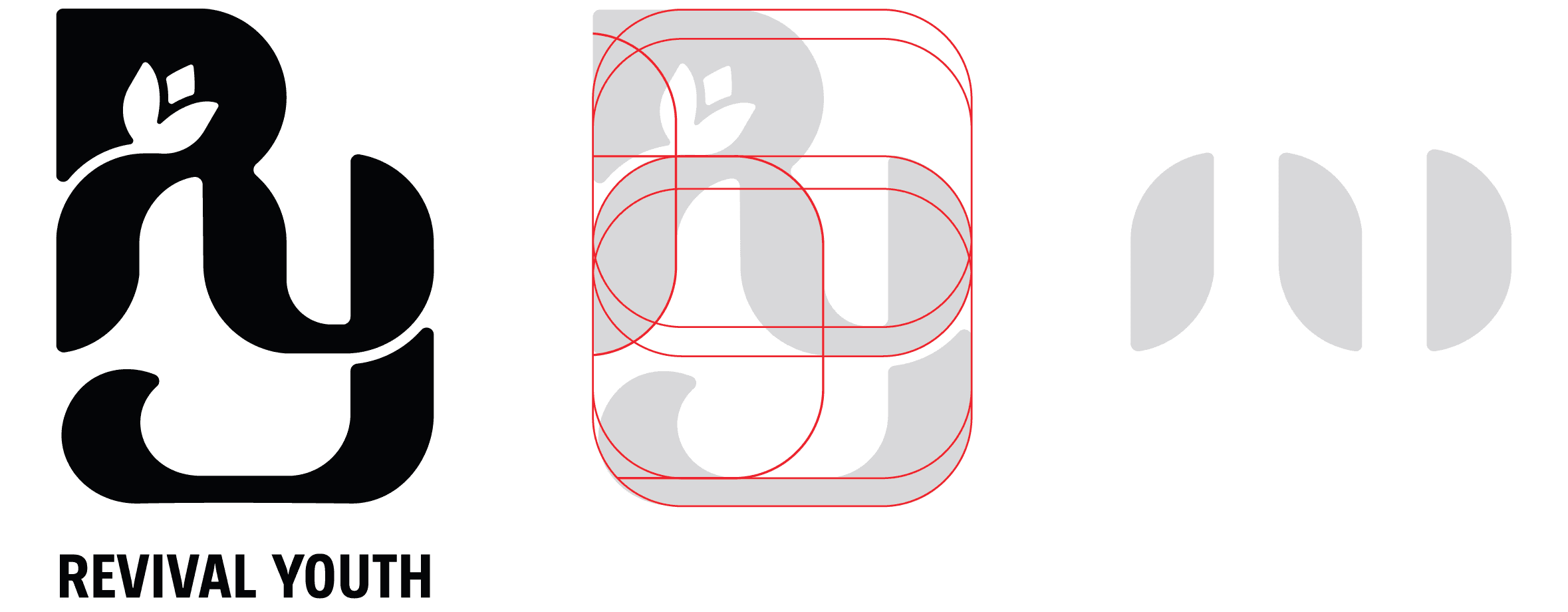
I constructed the youth logo with careful geometric precision, building the letterforms from repeating base shapes that create structural consistency throughout the mark. At the center of the design, I developed a sprouting flower that grows from the letter R, establishing the most important visual symbol within the church’s identity. This element intentionally embodies the meaning of “revival” by communicating new life, renewal, and spiritual growth while giving the mark a clear conceptual foundation that aligns with the church’s message and mission in a meaningful and impactful way.
The Process
I constructed the youth logo with careful geometric precision, building the letterforms from repeating base shapes that create structural consistency throughout the mark. At the center of the design, I developed a sprouting flower that grows from the letter R, establishing the most important visual symbol within the church’s identity. This element intentionally embodies the meaning of “revival” by communicating new life, renewal, and spiritual growth while giving the mark a clear conceptual foundation that aligns with the church’s message and mission in a meaningful and impactful way.

Letter can be isolated and still remains recognizable.
Letter can be isolated and still remains recognizable.
Letter can be isolated and still remains recognizable.

Application
I translated this foundation into the Revival Christian Church logo and identity system by refining the form for broader application and anchoring it in a distinct blue palette aligned with the church’s presence. The sprouting element remains central, carrying the concept of renewal while the structure is optimized for clarity and scalability.
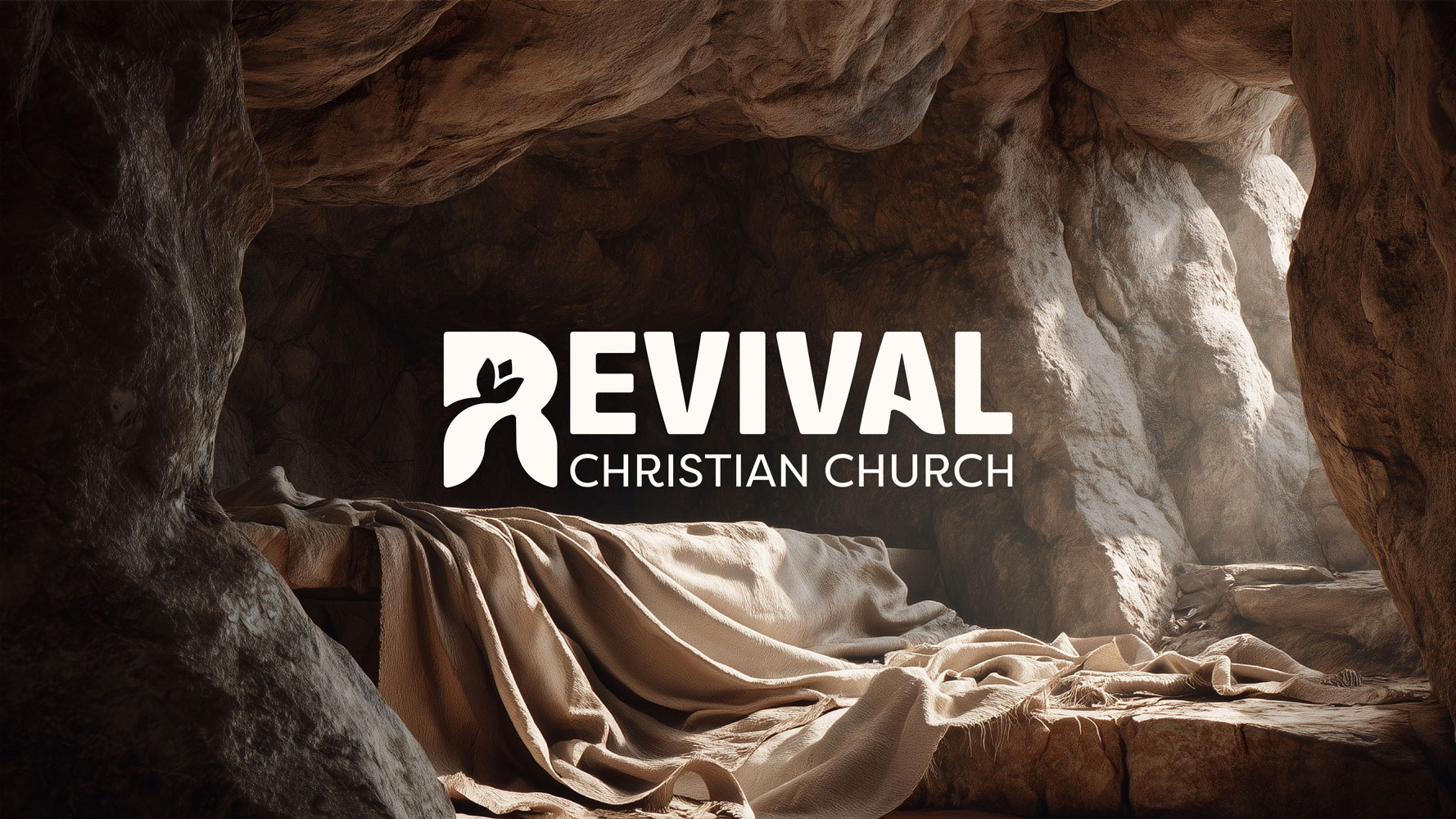
This system extends into presentation graphics, where the full logo adapts across seasonal contexts such as Christmas and Easter while maintaining consistency.
Application
I translated this foundation into the Revival Christian Church logo and identity system by refining the form for broader application and anchoring it in a distinct blue palette aligned with the church’s presence. The sprouting element remains central, carrying the concept of renewal while the structure is optimized for clarity and scalability.
This system extends into presentation graphics, where the full logo adapts across seasonal contexts such as Christmas and Easter while maintaining consistency.

Apparel
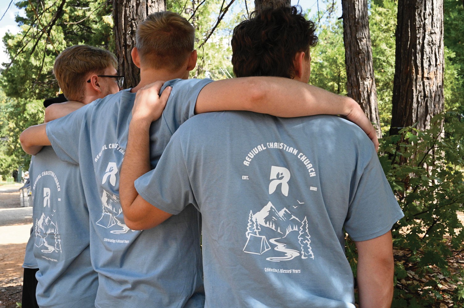
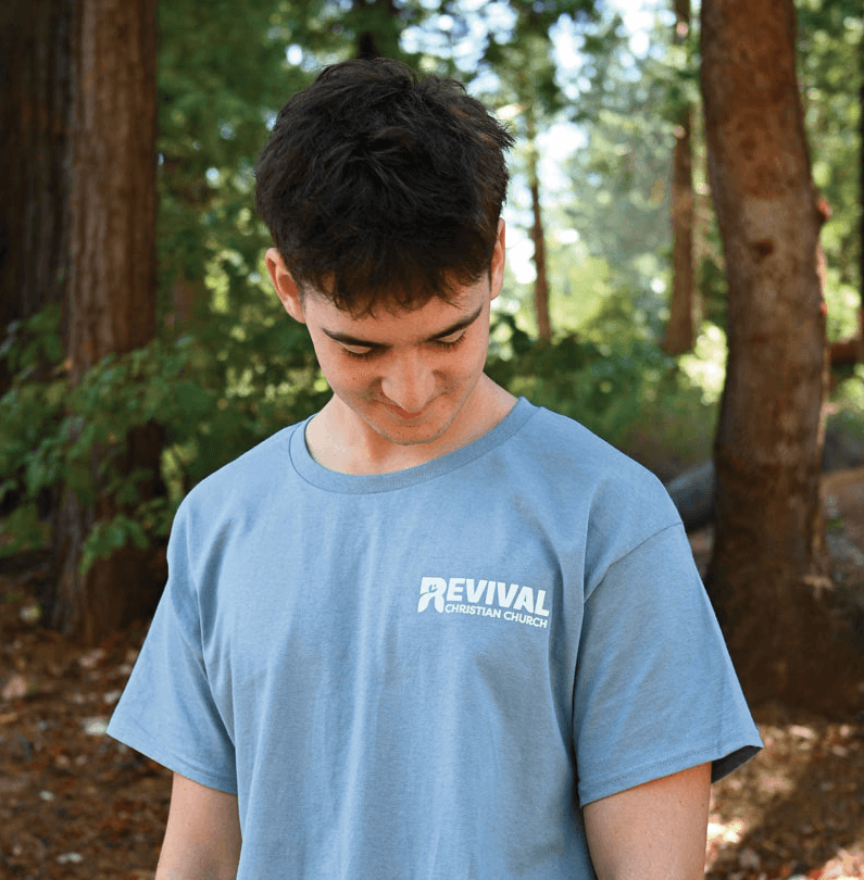
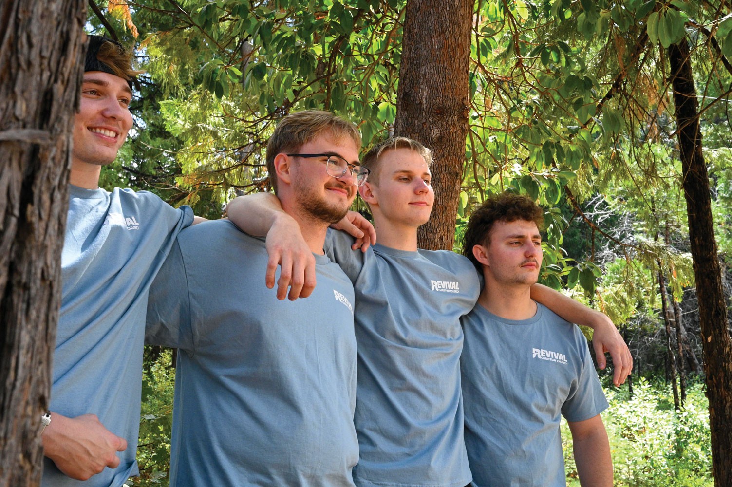
I isolated the “R” from the primary mark and applied it as a standalone graphic for the church's 5 year anniversary camp apparel, using its recognizable form to maintain a clear connection to the core identity.
By simplifying the composition and adjusting scale, placement, and supporting elements, the mark adapts to the context of the shirts while remaining visually consistent. This approach allows the design to function independently in a more expressive setting while still reinforcing the overall brand system.
Apparel
I isolated the “R” from the primary mark and applied it as a standalone graphic for the church's 5 year anniversary camp apparel, using its recognizable form to maintain a clear connection to the core identity.
By simplifying the composition and adjusting scale, placement, and supporting elements, the mark adapts to the context of the shirts while remaining visually consistent. This approach allows the design to function independently in a more expressive setting while still reinforcing the overall brand system.
Revival Youth Coffee Cart
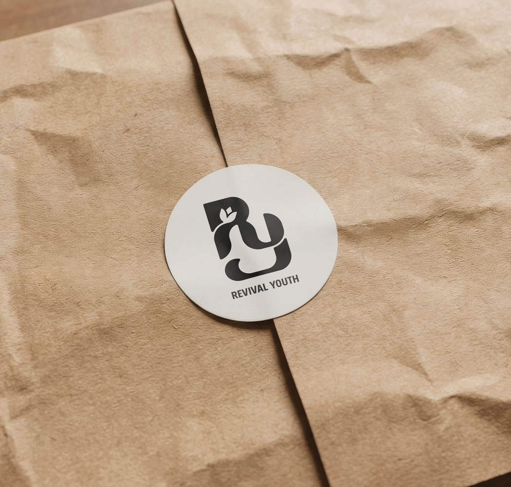
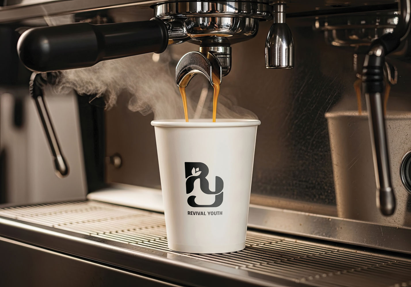
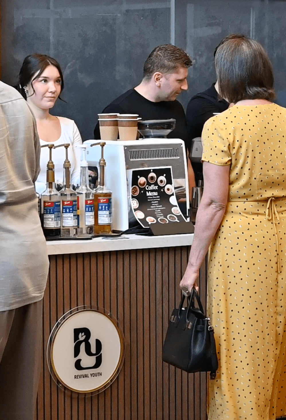
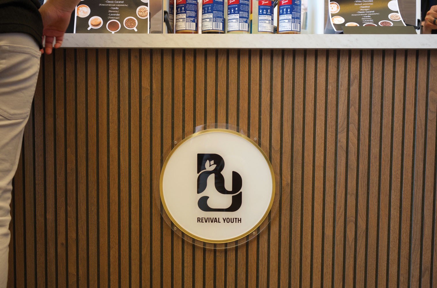
I extended the youth identity into a branded coffee cart, applying the logo across the cart structure, coffee cups, and stickers to create a cohesive, physical touchpoint. The mark translates effectively at multiple scales, maintaining clarity while reinforcing recognition within a social, high-traffic environment.
Revival Youth Coffee Cart
I extended the youth identity into a branded coffee cart, applying the logo across the cart structure, coffee cups, and stickers to create a cohesive, physical touchpoint. The mark translates effectively at multiple scales, maintaining clarity while reinforcing recognition within a social, high-traffic environment.
Revival Youth Coffee Cart
I extended the youth identity into a branded coffee cart, applying the logo across the cart structure, coffee cups, and stickers to create a cohesive, physical touchpoint. The mark translates effectively at multiple scales, maintaining clarity while reinforcing recognition within a social, high-traffic environment.