NEW AMERICAN SOUNDSCAPES FESTIVAL CAMPAIGN
Brand Identity, Campaign Design, Typography & Layout, Environmental Design, Web Design
Brand Identity, Campaign Design, Typography & Layout, Environmental Design, Web Design
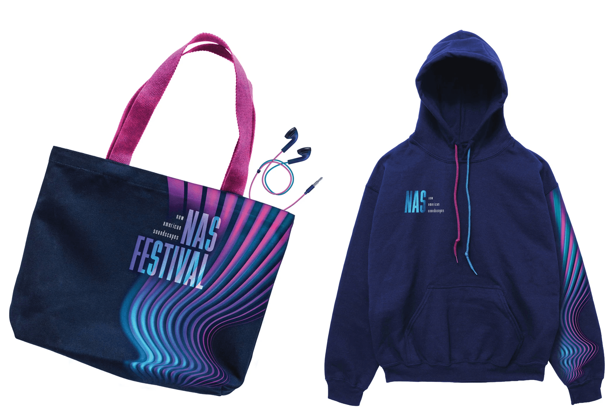
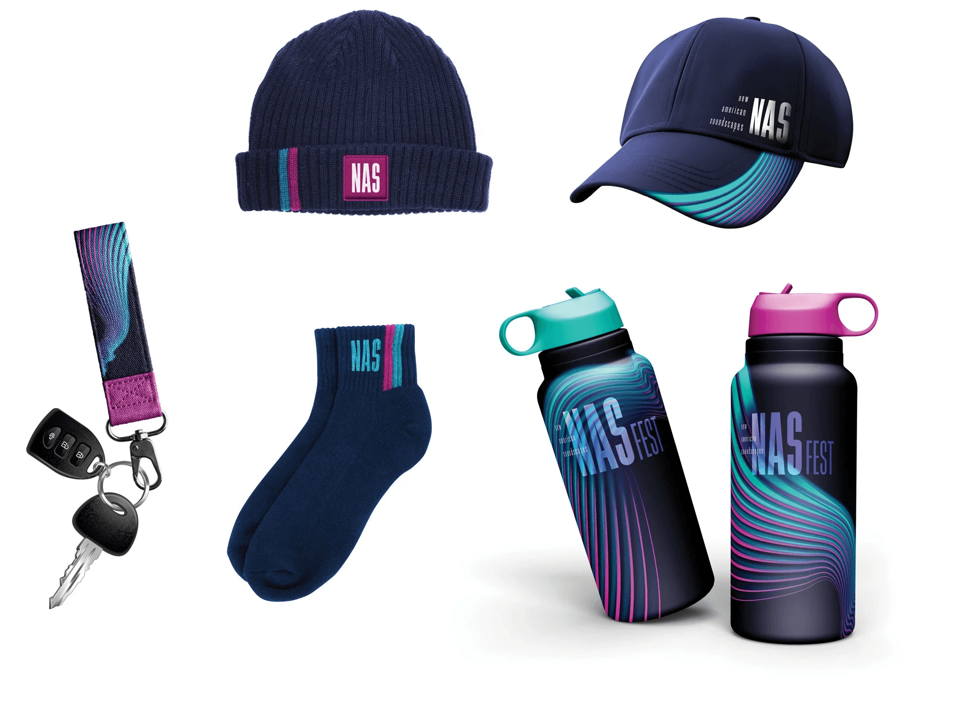
This project is a comprehensive visual identity and campaign for New American Soundscapes, a 7-day, multi-venue music festival in Sacramento that highlights contemporary American music across diverse performance styles. Each element reinforces a sense of rhythm, variation, and cohesion across formats. The result is a flexible campaign that holds together across multiple touchpoints while maintaining a distinct and memorable presence. It reflects my experimental yet structured approach to identity design, uniting concept, form, and application into one system.
This project is a comprehensive visual identity and campaign for New American Soundscapes, a 7-day, multi-venue music festival in Sacramento that highlights contemporary American music across diverse performance styles. Each element reinforces a sense of rhythm, variation, and cohesion across formats. The result is a flexible campaign that holds together across multiple touchpoints while maintaining a distinct and memorable presence. It reflects my experimental yet structured approach to identity design, uniting concept, form, and application into one system.
Language Development
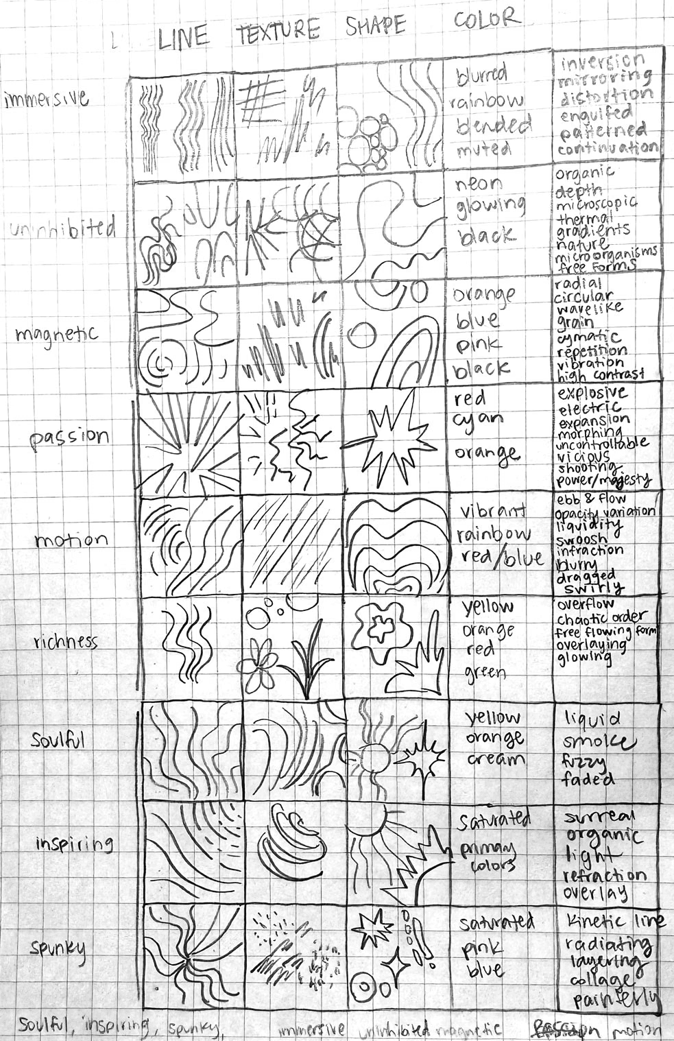
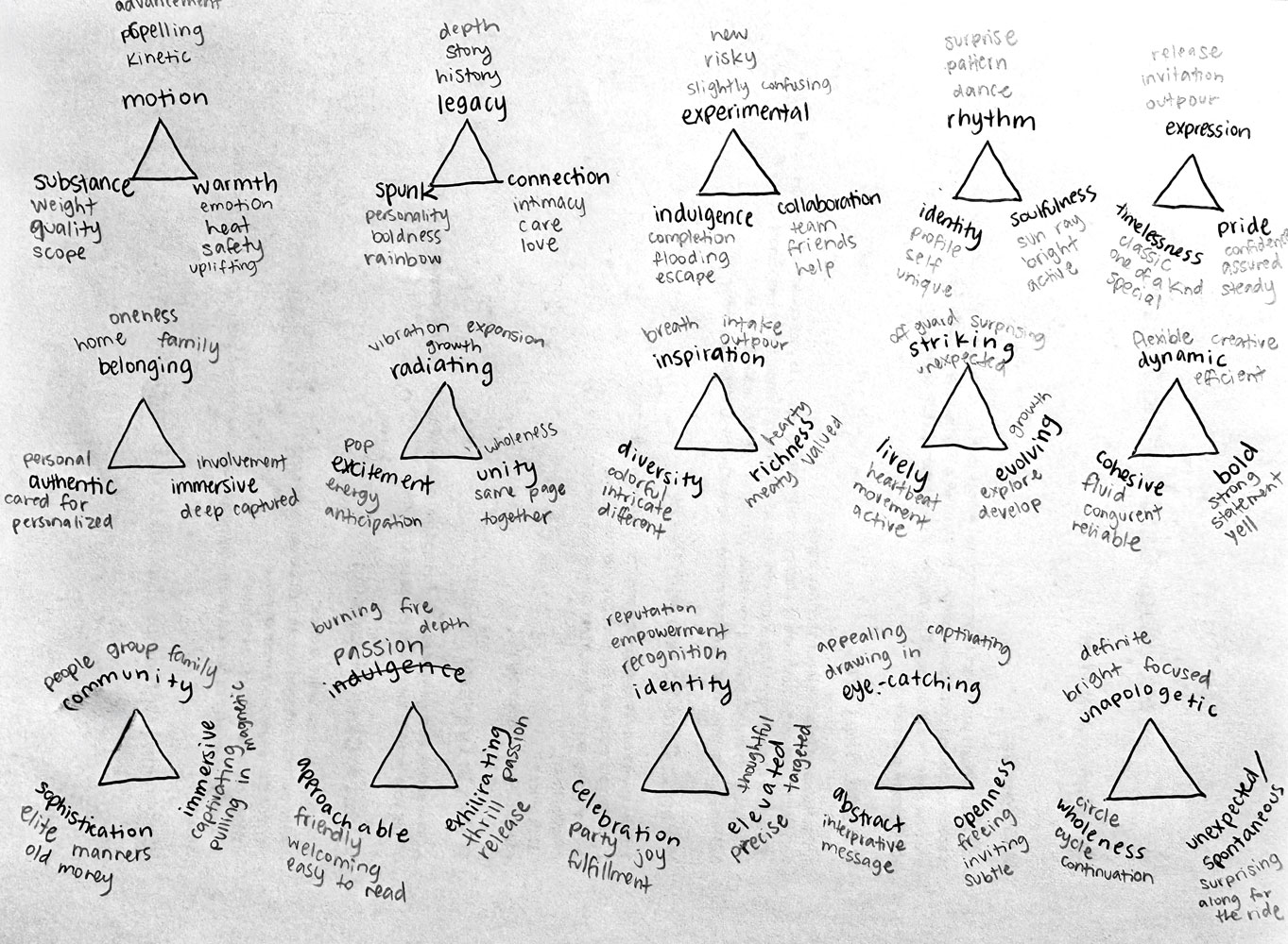
The process began with identifying a clear visual and conceptual language for the festival. Through image collection and analysis, key themes were distilled into structured word groupings that defined tone, energy, and direction. This phase focused on translating abstract qualities of contemporary music into visual terms that could guide design decisions across the entire system.
Language Development
The process began with identifying a clear visual and conceptual language for the festival. Through image collection and analysis, key themes were distilled into structured word groupings that defined tone, energy, and direction. This phase focused on translating abstract qualities of contemporary music into visual terms that could guide design decisions across the entire system.
Concept Exploration
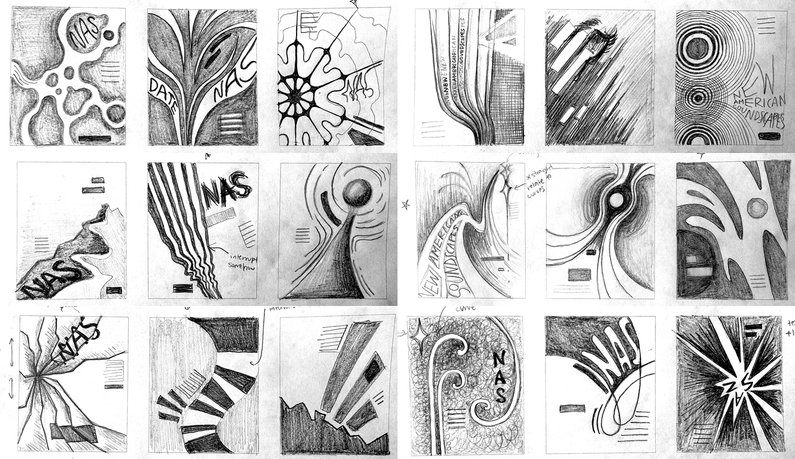
Using the established language, multiple visual directions were developed and tested. Each concept explored a different way of representing sound, movement, and energy through form, color, and composition. Concept moodboards and initial poster designs were used to evaluate how effectively each direction communicated the intended tone and how adaptable it could be across different formats.
Concept Exploration
Using the established language, multiple visual directions were developed and tested. Each concept explored a different way of representing sound, movement, and energy through form, color, and composition. Concept moodboards and initial poster designs were used to evaluate how effectively each direction communicated the intended tone and how adaptable it could be across different formats.
Visual System
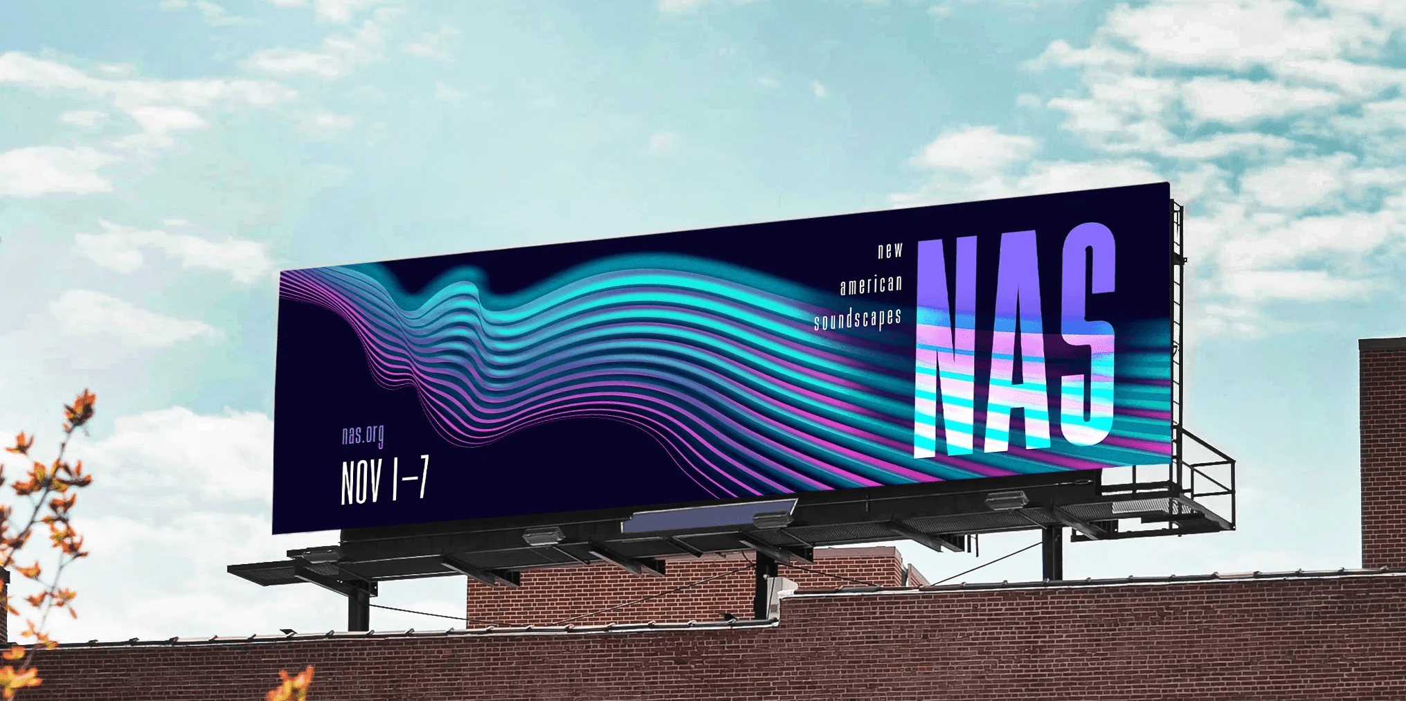
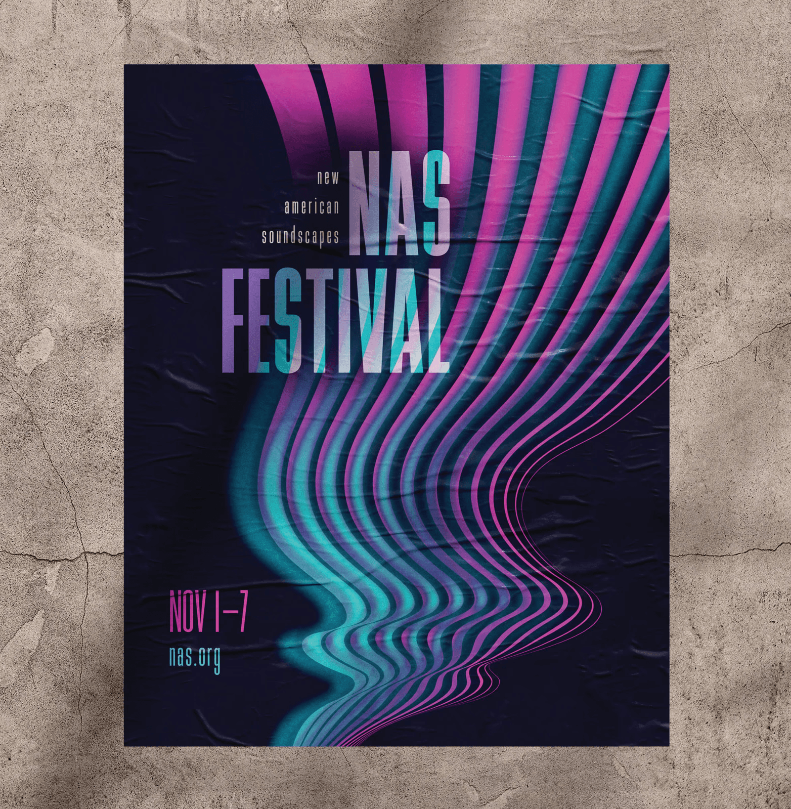
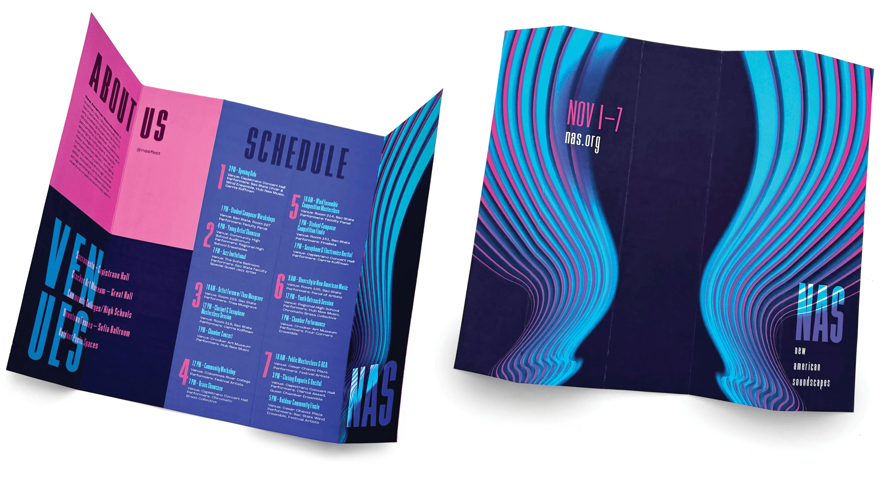
The selected concept was refined to balance energy with clarity while remaining flexible across all formats. The flowing wave form became the core visual element that translates sound into a continuous, immersive structure that suggests movement, rhythm, and variation without relying on literal musical symbols. Its behavior across compositions creates a sense of progression and continuity, which points back to the idea of a citywide, multi-venue experience. The use of high-contrast neon colors against a dark field establishes a strong visual presence and reflects the experimental and contemporary nature of the performances while still remaining legible and noticeable from a distance.
Typography plays a critical role in grounding the system. The vertical, structured type interrupts the organic motion of the wave. This contrast between controlled structure and fluid form mirrors the festival itself, where composed music and experimental expression combine. The concept is effective because it is visually distinctive, adaptable across scales, and directly aligned with the festival’s focus on movement, diversity, and contemporary sound.
Visual System
The selected concept was refined to balance energy with clarity while remaining flexible across all formats. The flowing wave form became the core visual element that translates sound into a continuous, immersive structure that suggests movement, rhythm, and variation without relying on literal musical symbols. Its behavior across compositions creates a sense of progression and continuity, which points back to the idea of a citywide, multi-venue experience. The use of high-contrast neon colors against a dark field establishes a strong visual presence and reflects the experimental and contemporary nature of the performances while still remaining legible and noticeable from a distance.
Typography plays a critical role in grounding the system. The vertical, structured type interrupts the organic motion of the wave. This contrast between controlled structure and fluid form mirrors the festival itself, where composed music and experimental expression combine. The concept is effective because it is visually distinctive, adaptable across scales, and directly aligned with the festival’s focus on movement, diversity, and contemporary sound.
System Application
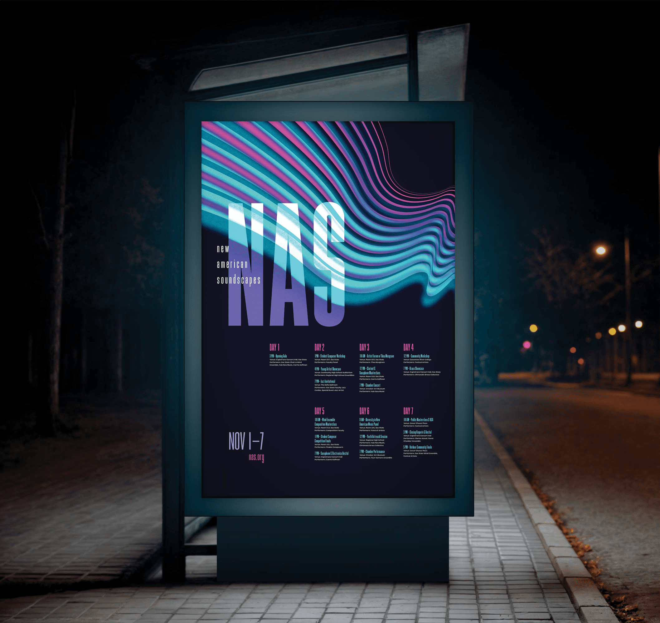
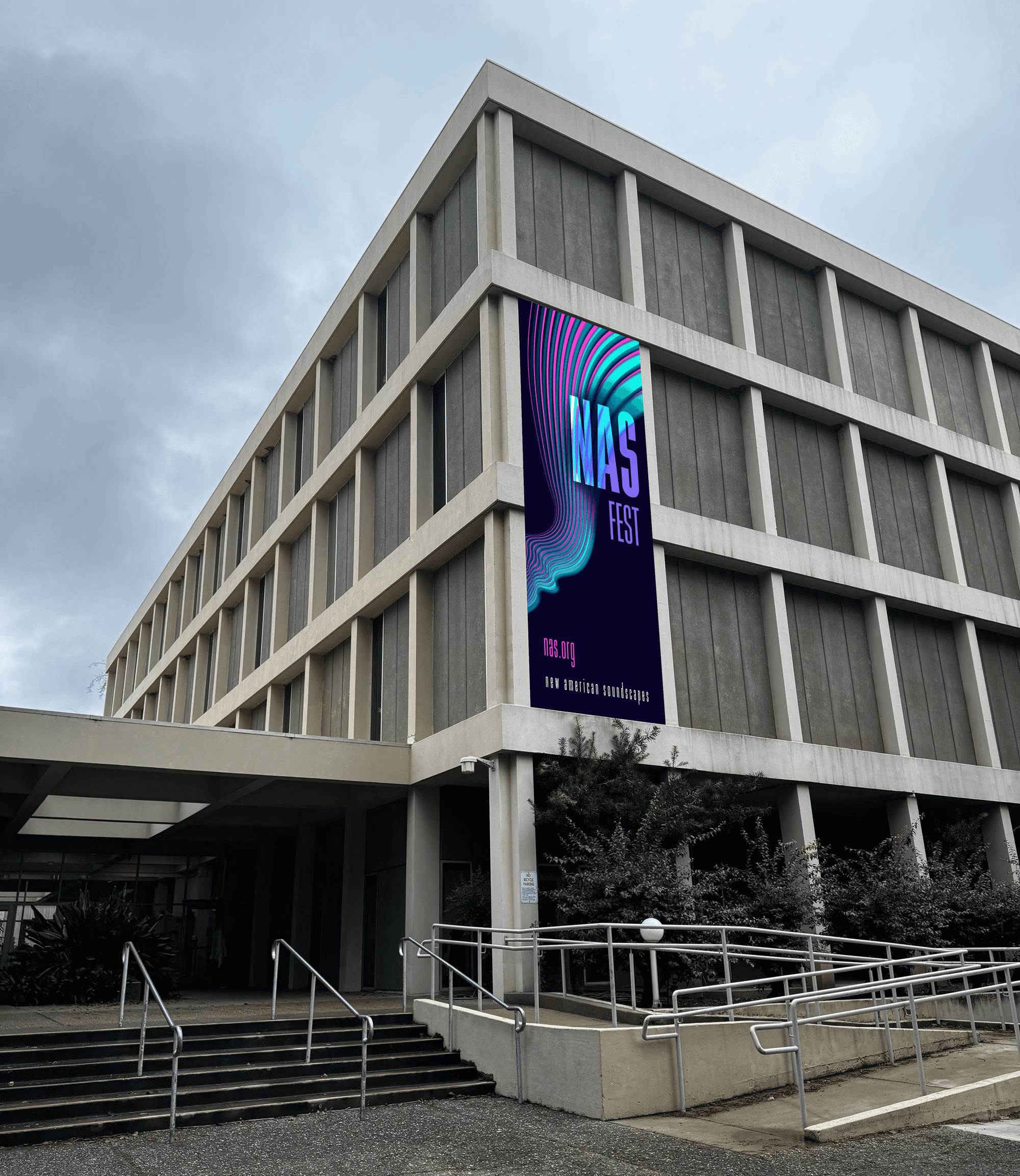
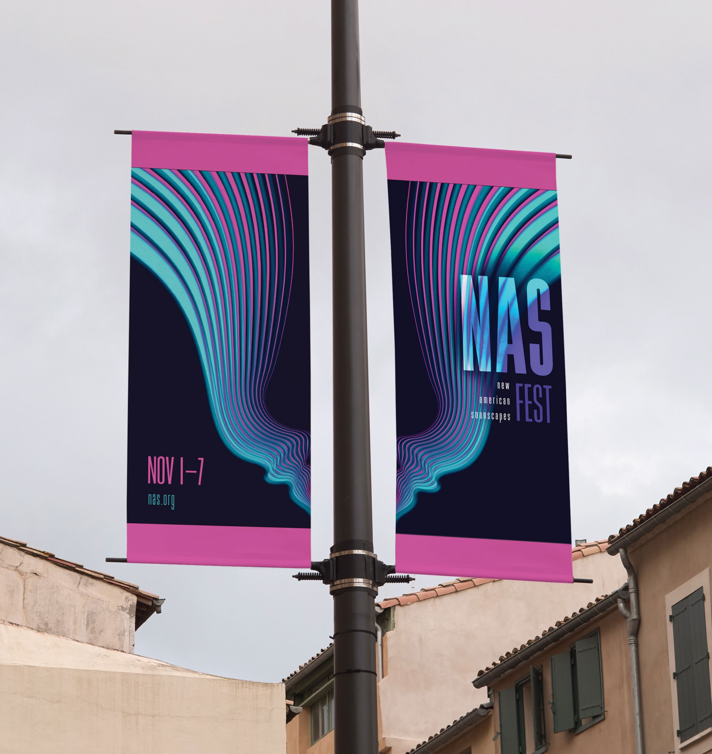
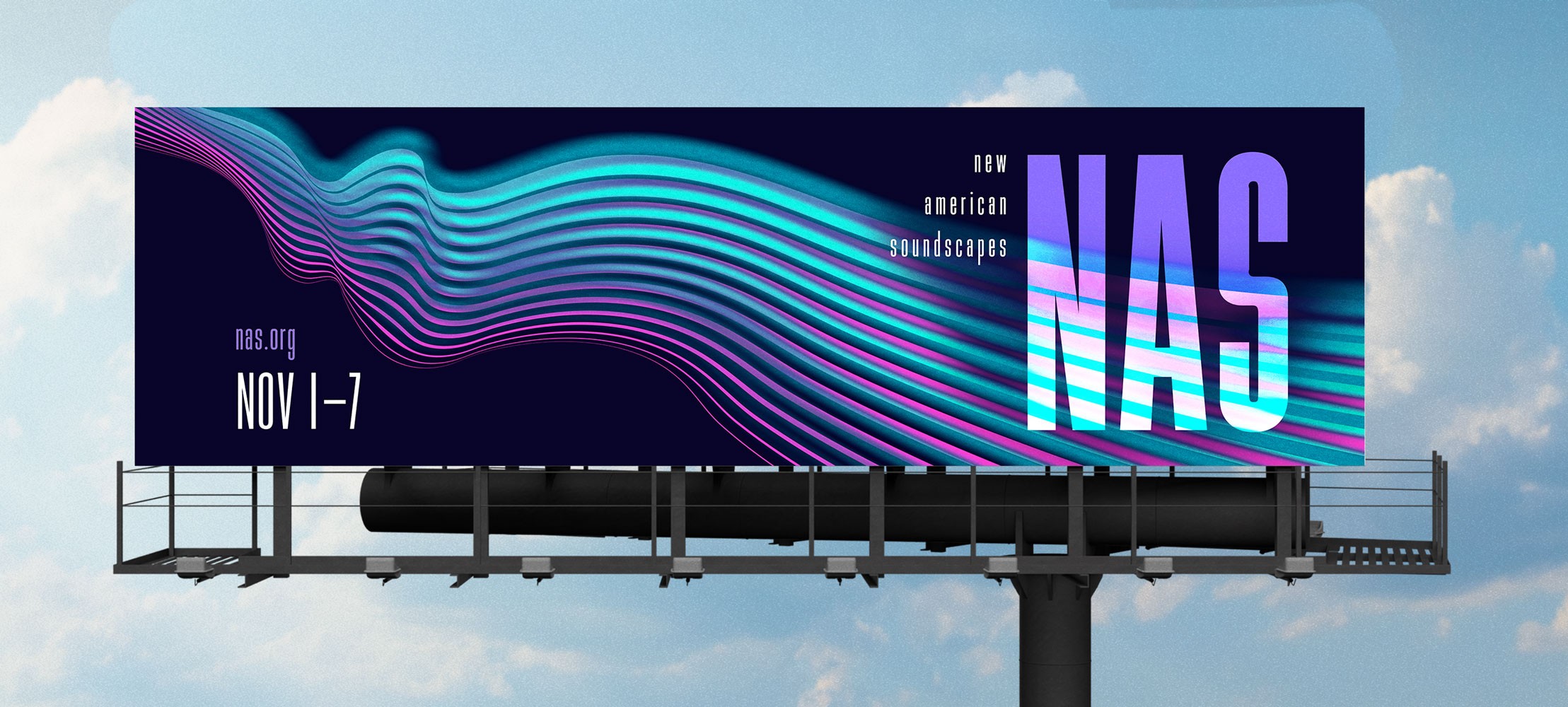
The finalized identity was applied across all required deliverables, including print, environmental, and digital formats. Each piece was designed to function independently while reinforcing the overall system, ensuring consistency in layout, hierarchy, and visual language. This phase focused on translating the concept into a cohesive and functional campaign.
System Application
The finalized identity was applied across all required deliverables, including print, environmental, and digital formats. Each piece was designed to function independently while reinforcing the overall system, ensuring consistency in layout, hierarchy, and visual language. This phase focused on translating the concept into a cohesive and functional campaign.
Tap Through!
Tap Through!
Online Presence
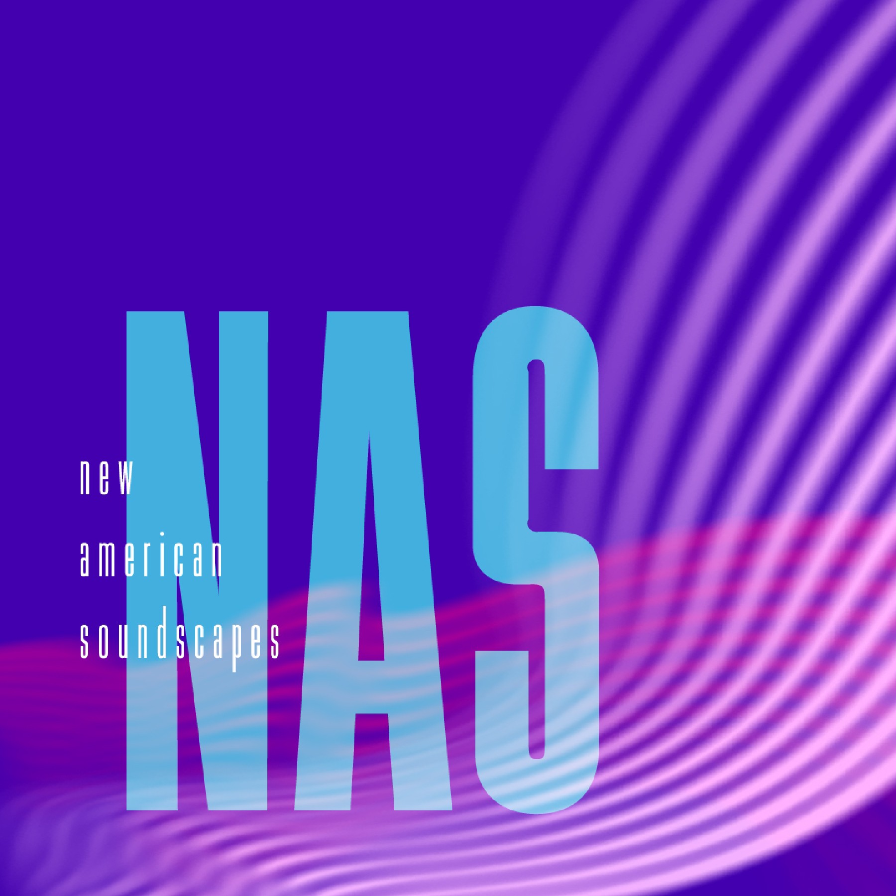
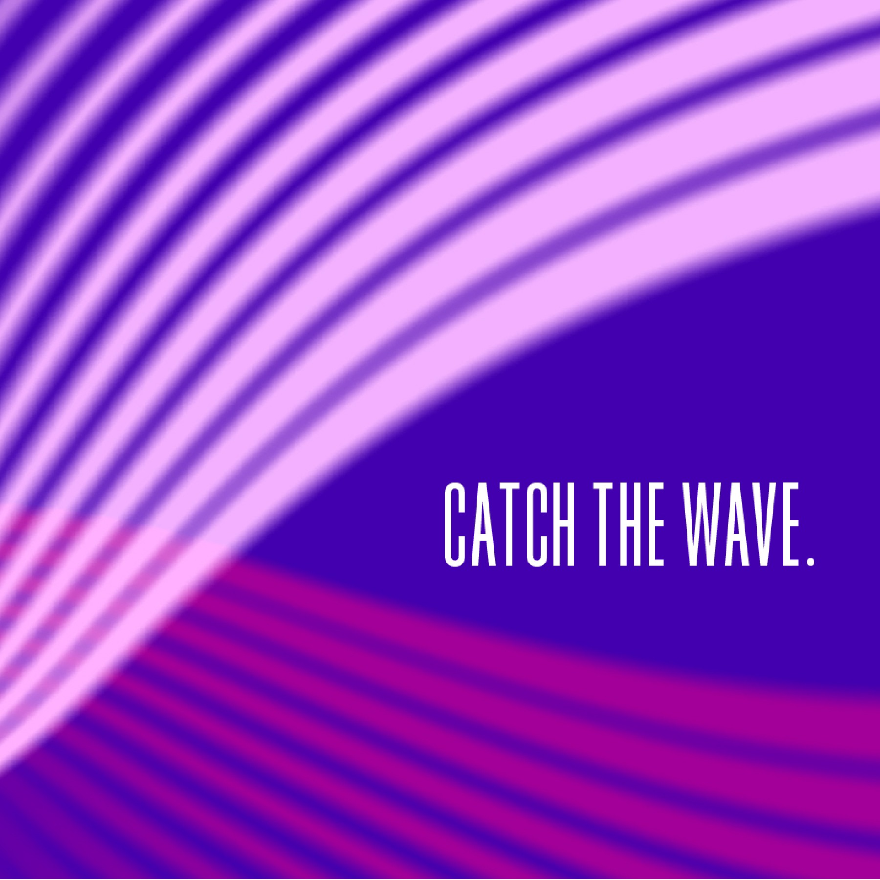
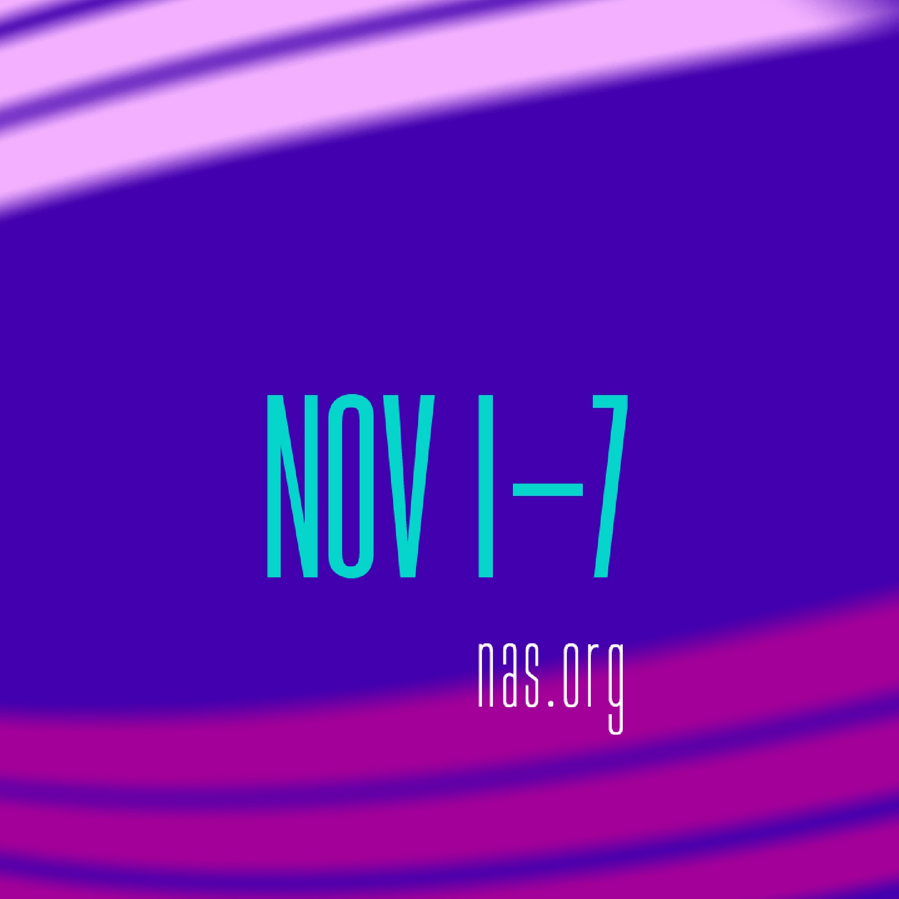
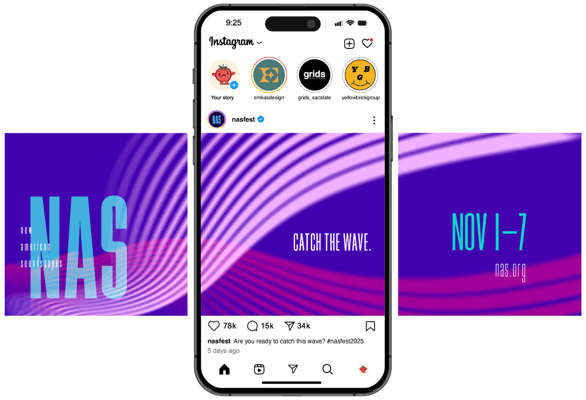
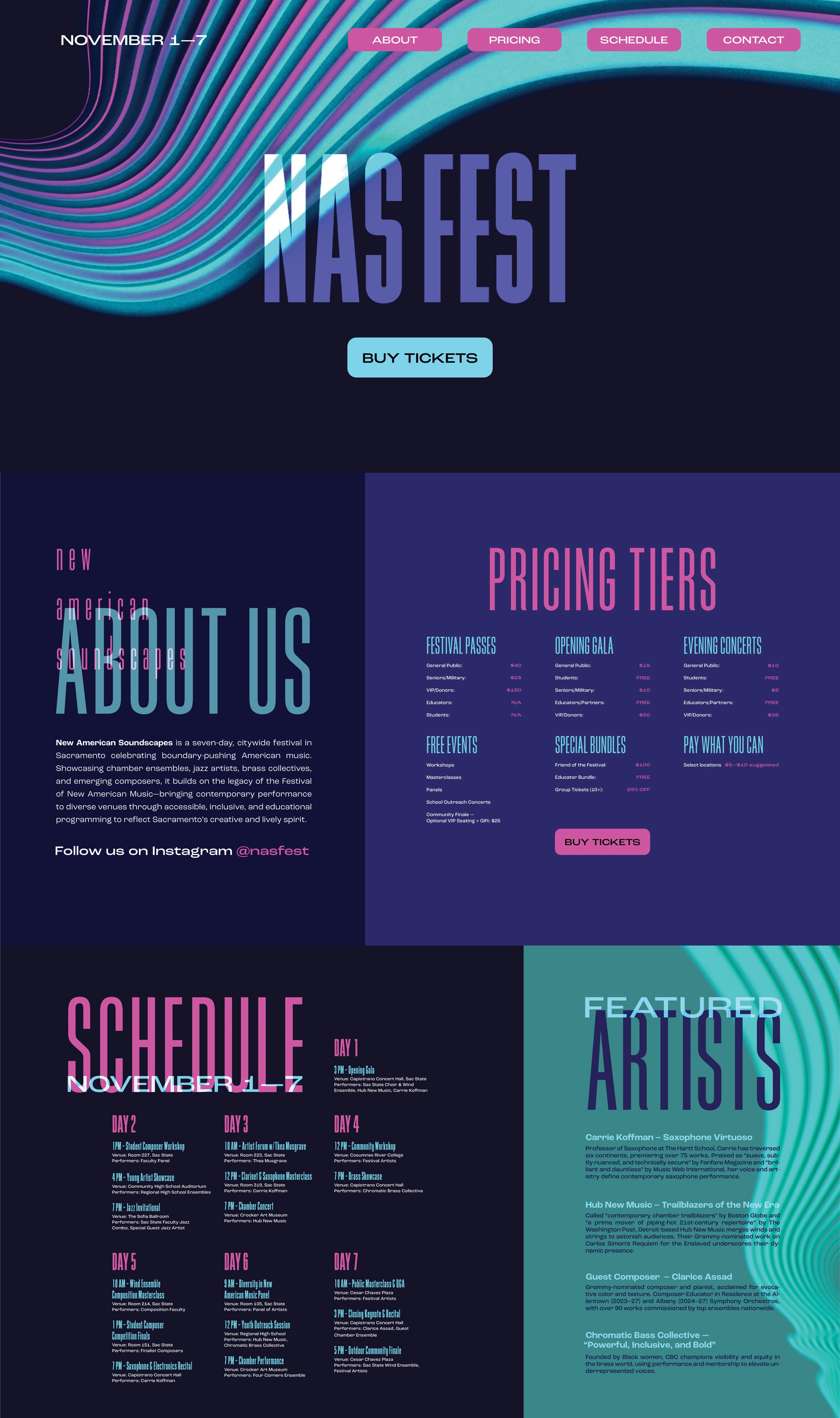
The website and social media campaign serve as the central access point for the festival, making them the most critical components of the system. While print and environmental materials generate awareness, the website is where users engage directly with the festival by viewing schedules, learning about performers, and purchasing tickets. Because of this, it was essential to carry the visual identity into a digital environment without losing brand recognition. The same wave-based visual language and typographic structure are maintained to ensure continuity, while layouts are adapted for navigation, hierarchy, and readability across screens.
The color palette is slightly expanded in digital applications to support a wider range of interactions and content, but remains anchored in the core brand colors of resonant purple, electric blue, and brilliant pink. These colors create a consistent and recognizable presence across both the website and social media and reinforce the NAS identity. These platforms extend the campaign beyond static visuals, by creating a functional and cohesive system that supports both engagement and ticket conversion.
Online Presence
The website and social media campaign serve as the central access point for the festival, making them the most critical components of the system. While print and environmental materials generate awareness, the website is where users engage directly with the festival by viewing schedules, learning about performers, and purchasing tickets. Because of this, it was essential to carry the visual identity into a digital environment without losing brand recognition. The same wave-based visual language and typographic structure are maintained to ensure continuity, while layouts are adapted for navigation, hierarchy, and readability across screens.
The color palette is slightly expanded in digital applications to support a wider range of interactions and content, but remains anchored in the core brand colors of resonant purple, electric blue, and brilliant pink. These colors create a consistent and recognizable presence across both the website and social media and reinforce the NAS identity. These platforms extend the campaign beyond static visuals, by creating a functional and cohesive system that supports both engagement and ticket conversion.
Website
Website
Website
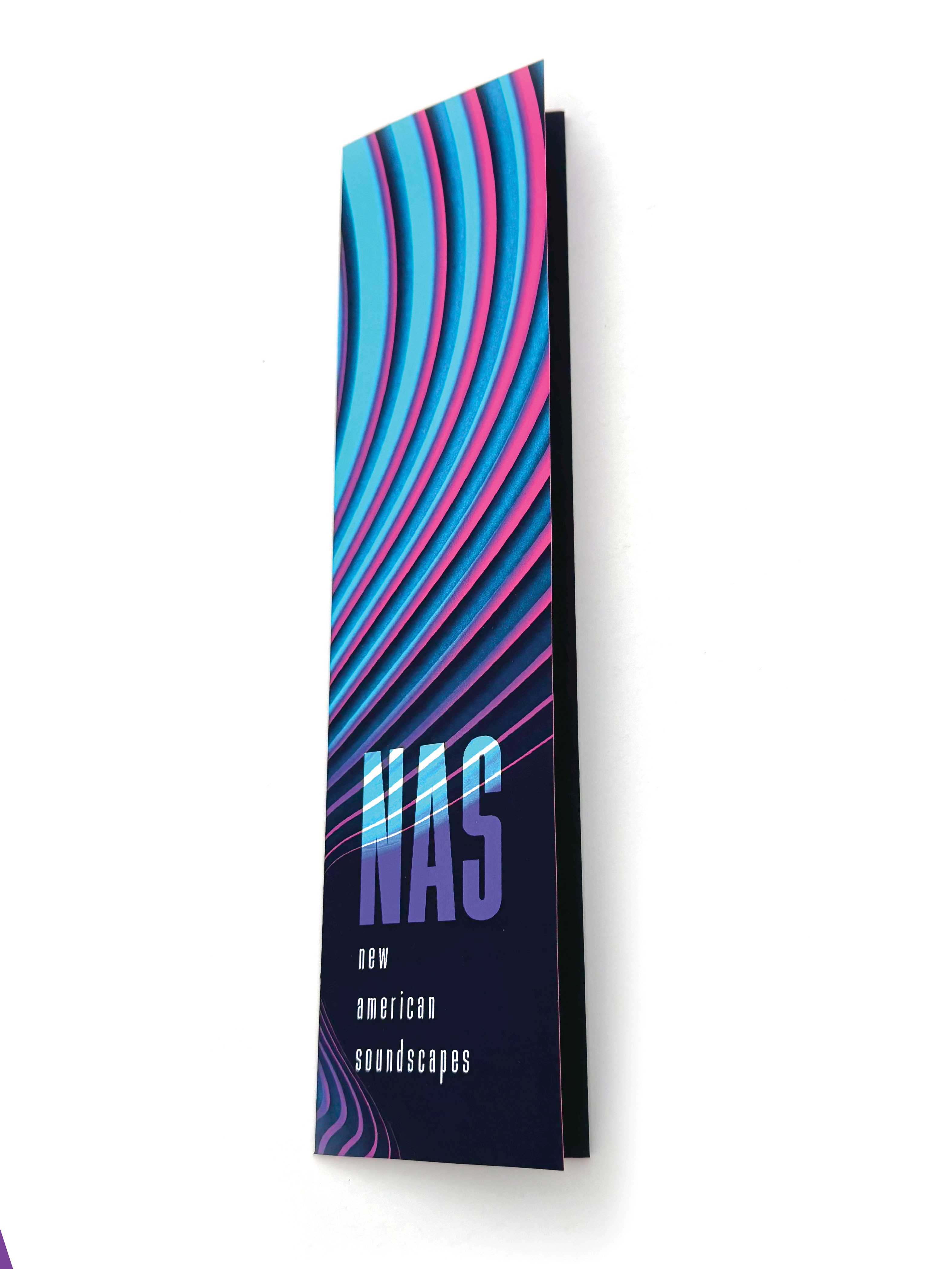
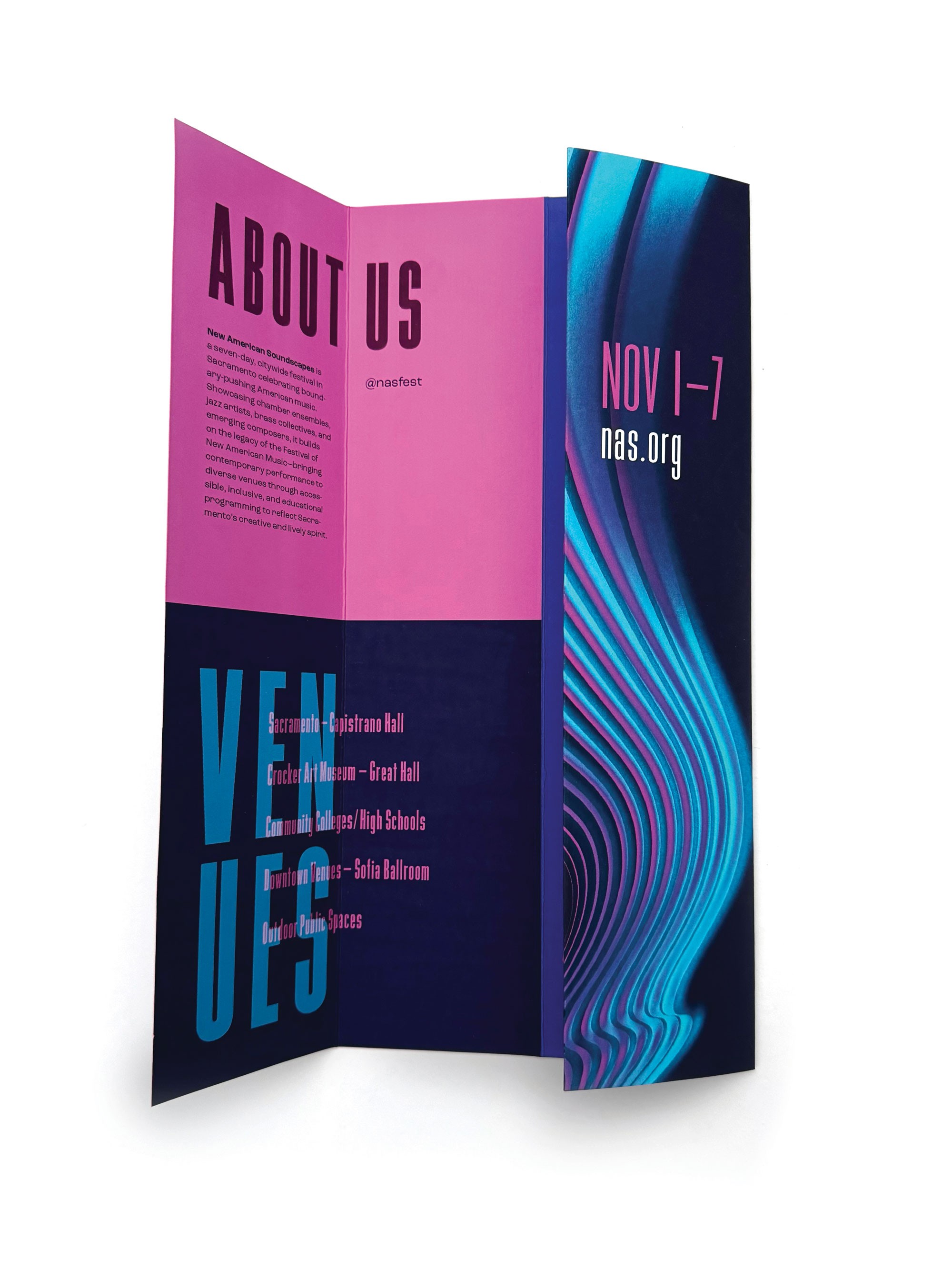
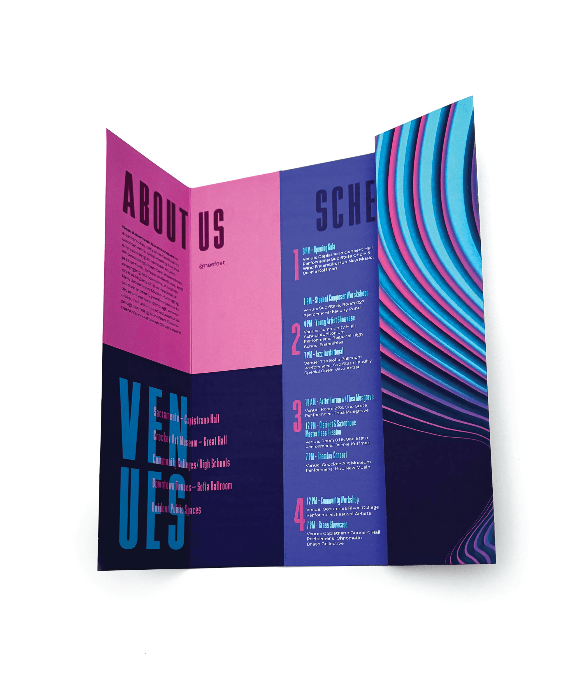
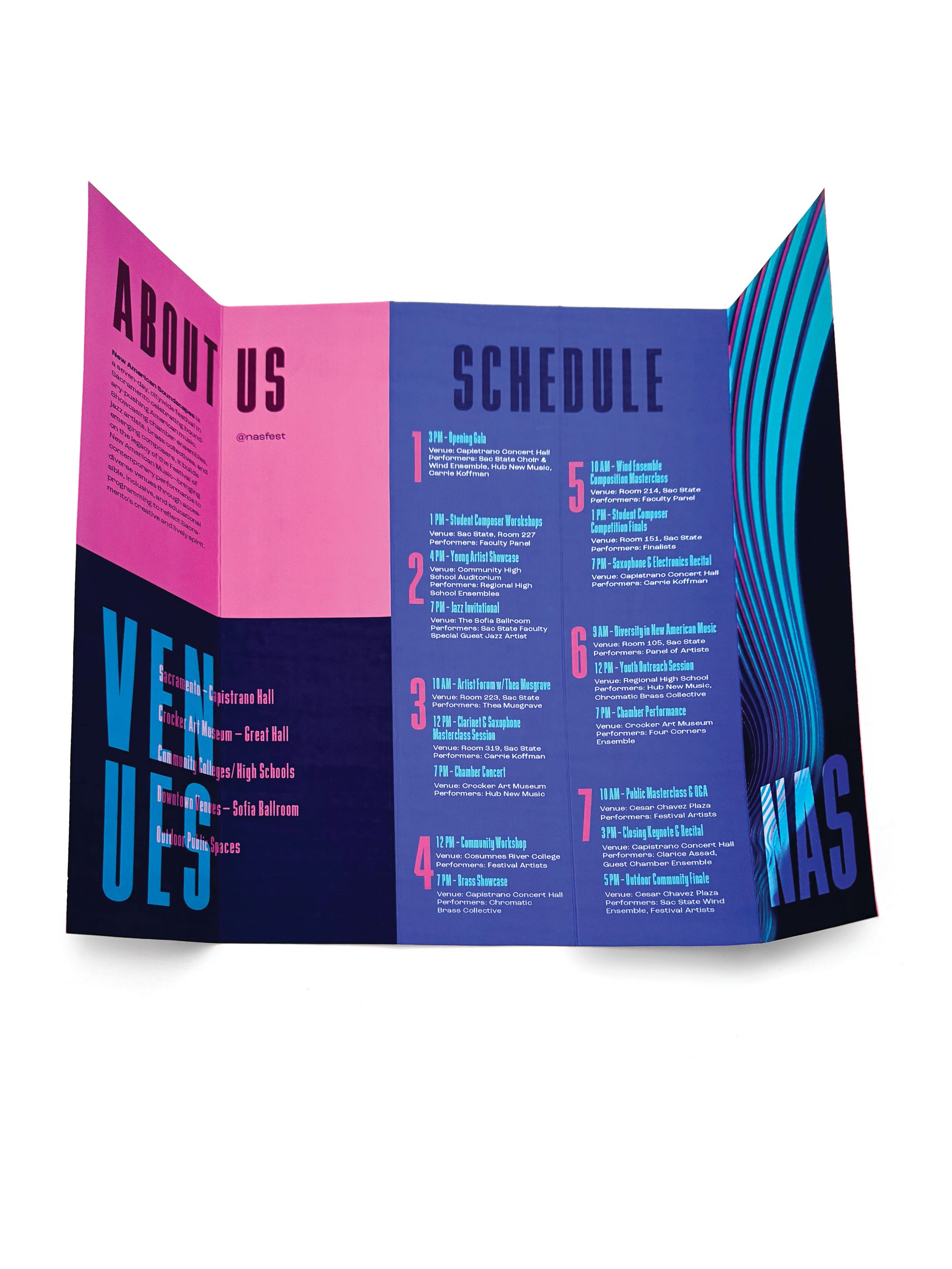
Handheld Schedule
Handheld Schedule
Tap Through!
Tap Through!
Merchandise
Merchandise
Merchandise