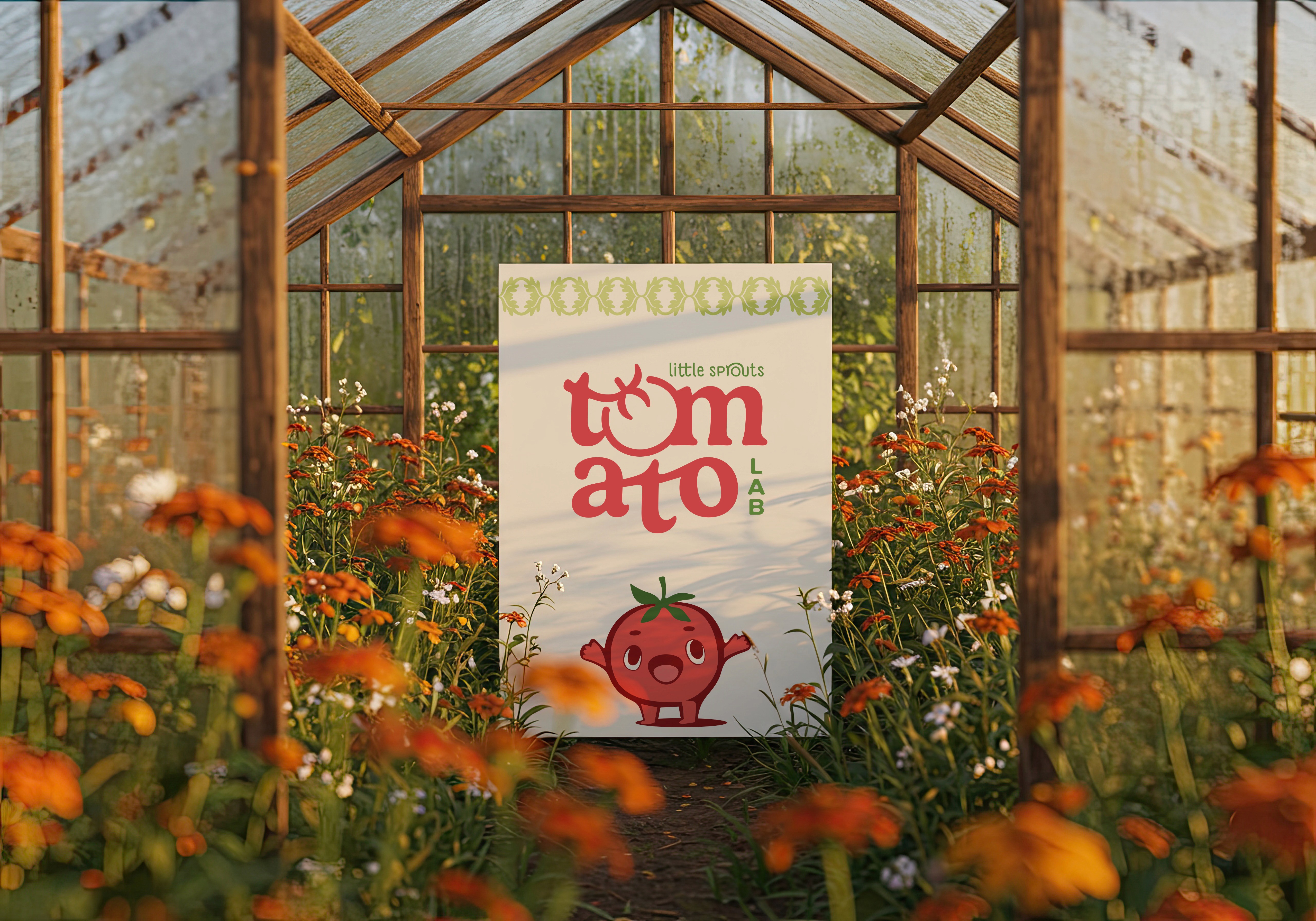
LITTLE SPROUTS TOMATO LAB
Brand Identity, Illustration, Packaging Design, Experiential Design
Brand Identity, Illustration, Packaging Design, Experiential Design
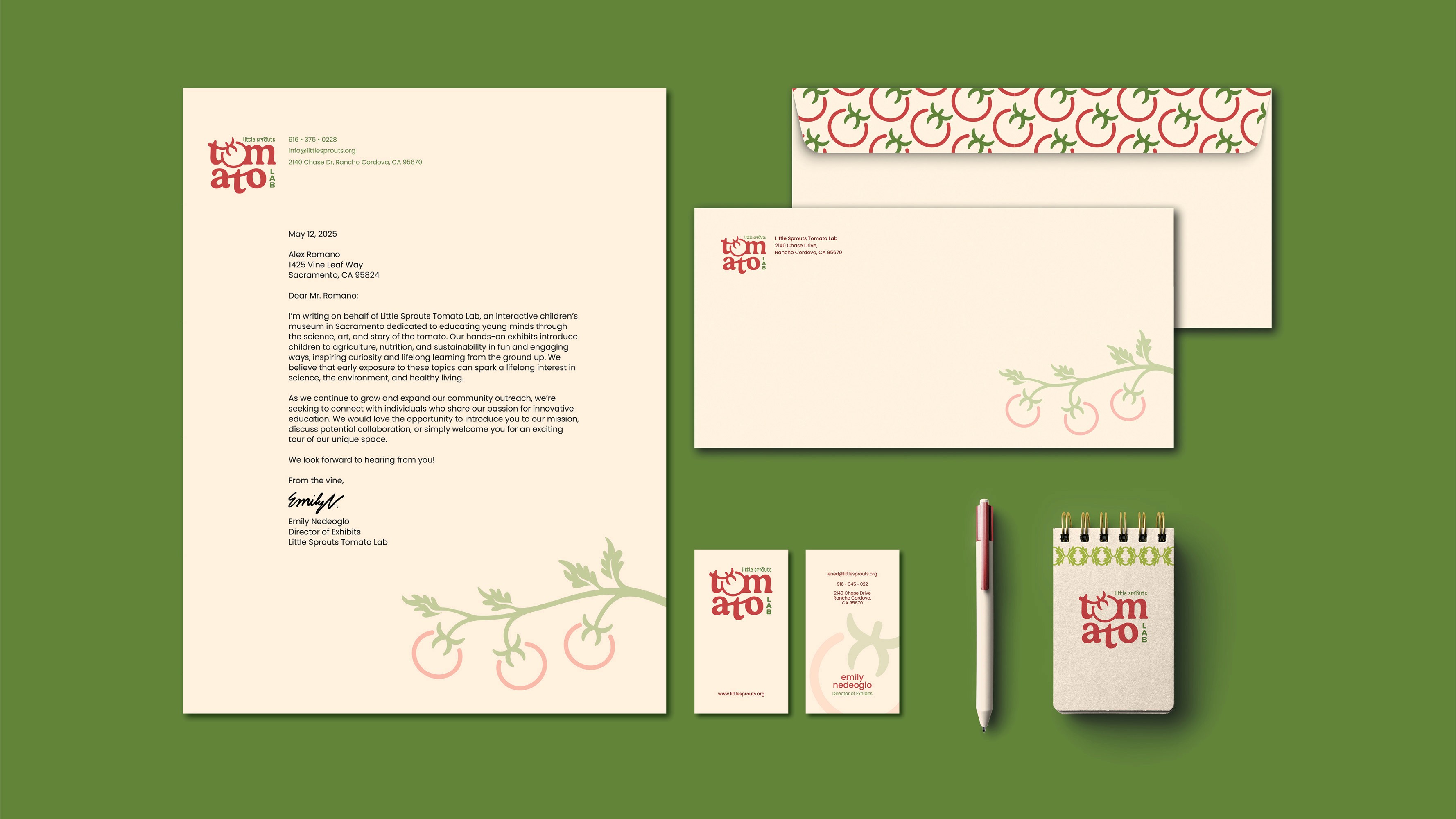
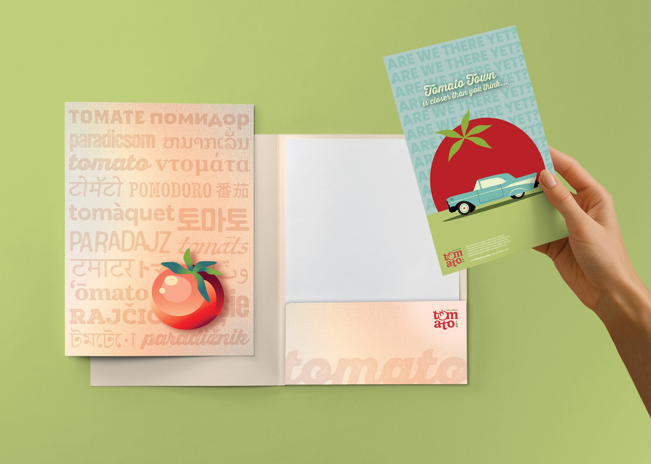
This project develops a cohesive visual identity and product system for Little Sprouts Tomato Lab, an interactive children’s museum centered on learning through play and hands-on exploration. The system extends into a range of tactile applications, including tickets, merchandise, and packaged goods, where I reimagined familiar formats such as nutrition labels to function as storytelling tools that introduce humor, interaction, and educational value. By designing both two-dimensional and physical elements, the project demonstrates my ability to translate a concept into an immersive and personalized brand experience that engages users through touch, narrative, and participation.
This project develops a cohesive visual identity and product system for Little Sprouts Tomato Lab, an interactive children’s museum centered on learning through play and hands-on exploration. The system extends into a range of tactile applications, including tickets, merchandise, and packaged goods, where I reimagined familiar formats such as nutrition labels to function as storytelling tools that introduce humor, interaction, and educational value. By designing both two-dimensional and physical elements, the project demonstrates my ability to translate a concept into an immersive and personalized brand experience that engages users through touch, narrative, and participation.
Growing the Identity
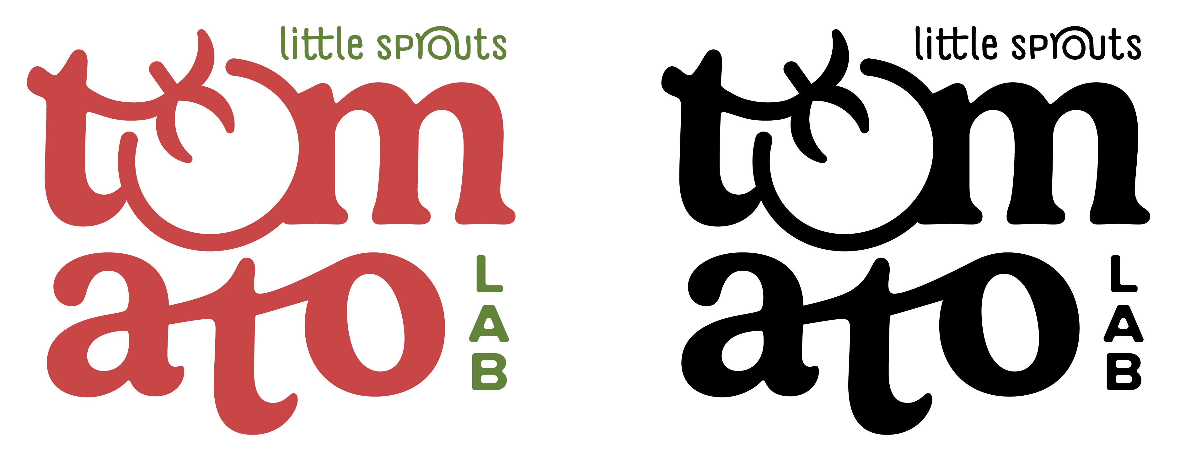
The logo was developed to reflect the museum’s focus on play, learning, and interaction, using simple, rounded forms and expressive proportions that feel approachable to a younger audience. The mark is designed to function clearly in both full color and black and white, ensuring flexibility across applications. A defined Pantone palette of Tangy Red and Pistachio Green anchors the identity, and introduces a bright, energetic tone that aligns with the museum’s playful environment.
Growing the Identity
The logo was developed to reflect the museum’s focus on play, learning, and interaction, using simple, rounded forms and expressive proportions that feel approachable to a younger audience. The mark is designed to function clearly in both full color and black and white, ensuring flexibility across applications. A defined Pantone palette of Tangy Red and Pistachio Green anchors the identity, and introduces a bright, energetic tone that aligns with the museum’s playful environment.
Designing for Immersion
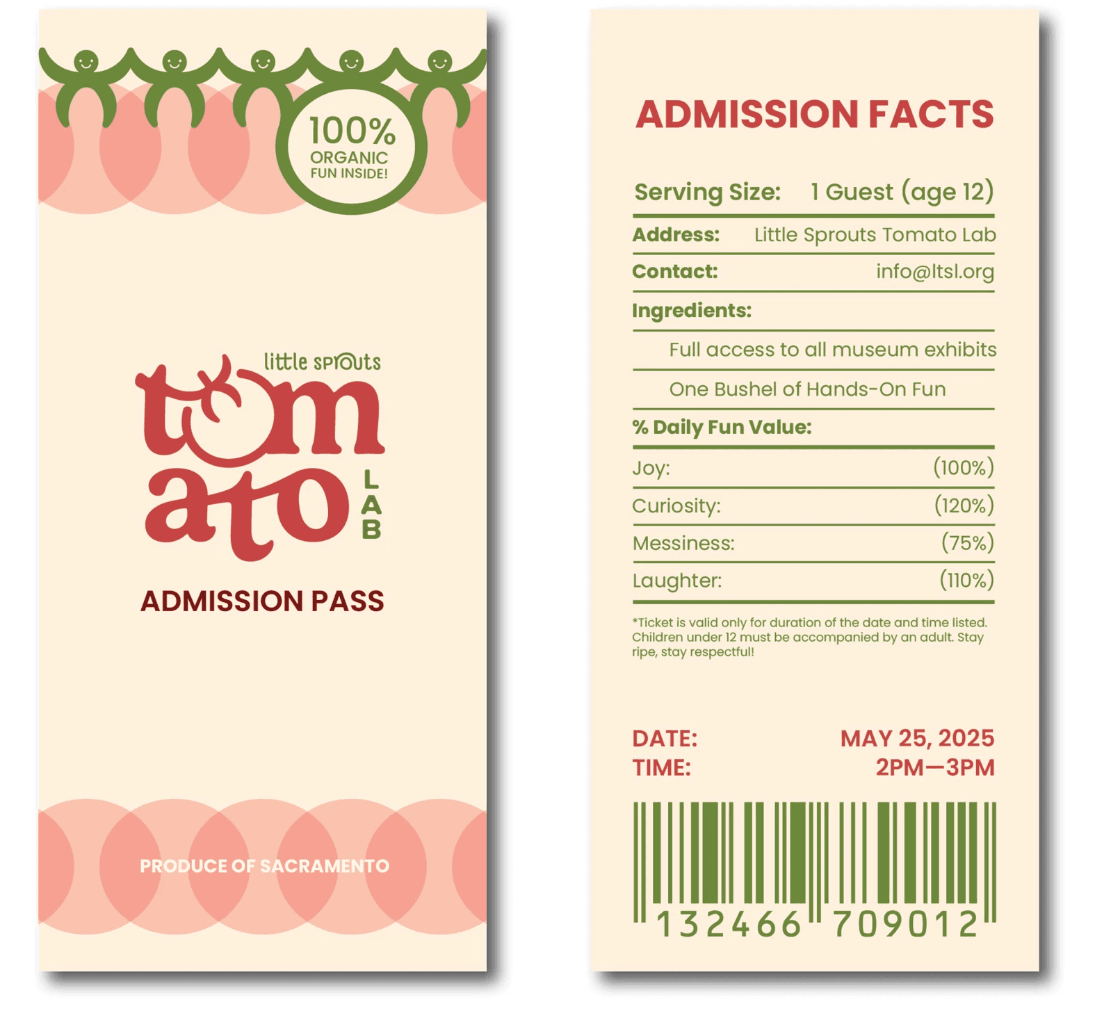
A key component of the system is the admission ticket, designed as a reimagined nutrition label. This format transforms a familiar structure into an interactive experience, embedding information within a playful and unexpected layout. It reflects the brand’s commitment to immersion by aligning every touchpoint with the world of the museum and encouraging curiosity through design.
Designing for Immersion
A key component of the system is the admission ticket, designed as a reimagined nutrition label. This format transforms a familiar structure into an interactive experience, embedding information within a playful and unexpected layout. It reflects the brand’s commitment to immersion by aligning every touchpoint with the world of the museum and encouraging curiosity through design.
The Experience
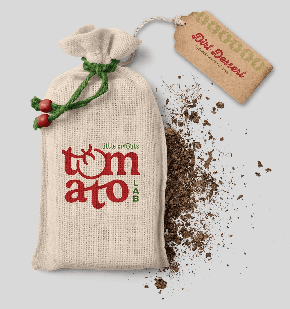
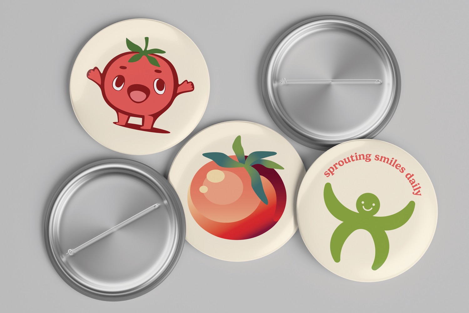
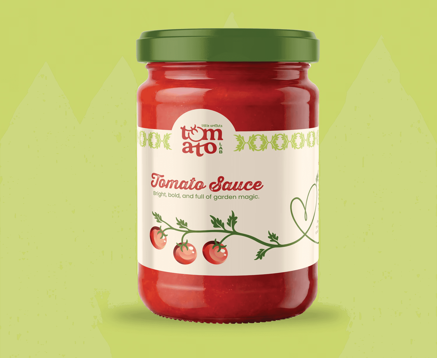
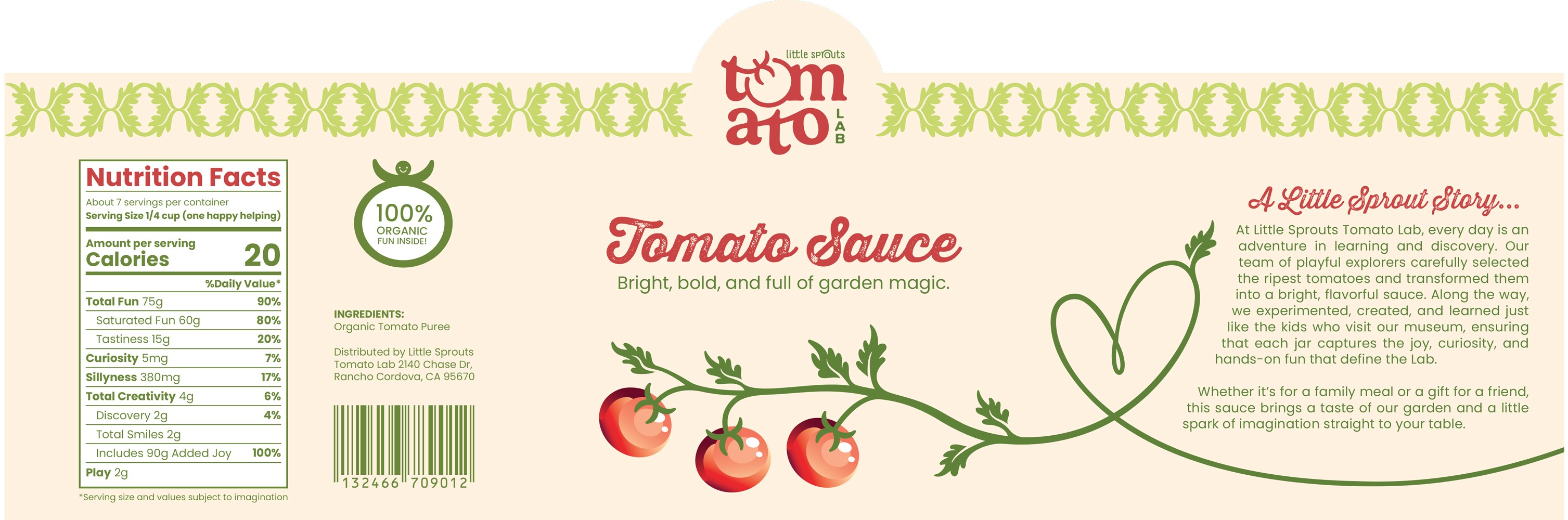
The system expands into merchandise, where everyday items are reinterpreted as part of the brand narrative. “Dirt Dessert,” a nutrient-dense soil topper, reframes fertilizer as a playful product through naming and packaging. Additional items, including buttons and a tomato sauce jar with unconventional informational graphics, continue this approach. Each piece extends the identity into tangible experiences that encourage interaction, humor, and exploration.
The Experience
The system expands into merchandise, where everyday items are reinterpreted as part of the brand narrative. “Dirt Dessert,” a nutrient-dense soil topper, reframes fertilizer as a playful product through naming and packaging. Additional items, including buttons and a tomato sauce jar with unconventional informational graphics, continue this approach. Each piece extends the identity into tangible experiences that encourage interaction, humor, and exploration.
Customized nutrition label
Customized nutrition label
Customized nutrition label
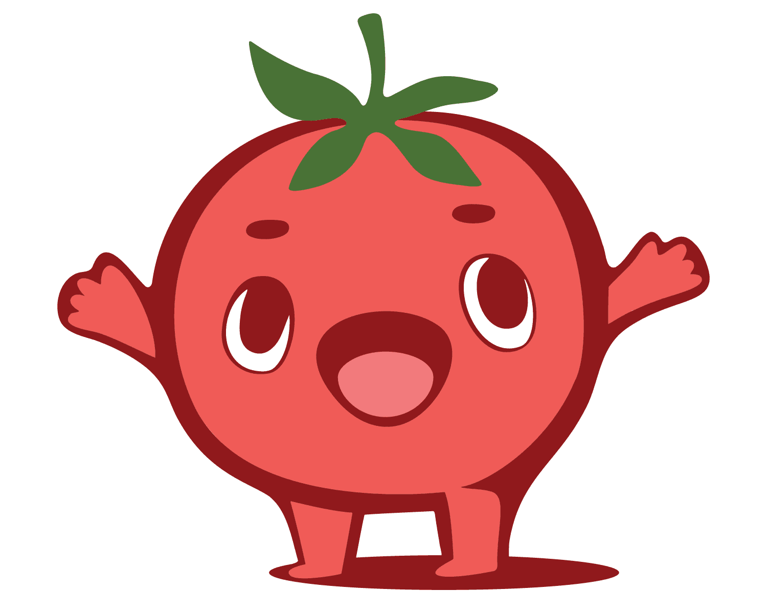
Tommy the Tomato :)
Tommy the Tomato :)
Tommy the Tomato :)

