EDITORIAL MAGAZINE
Publication Design, Typography & Layout
Publication Design, Typography & Layout
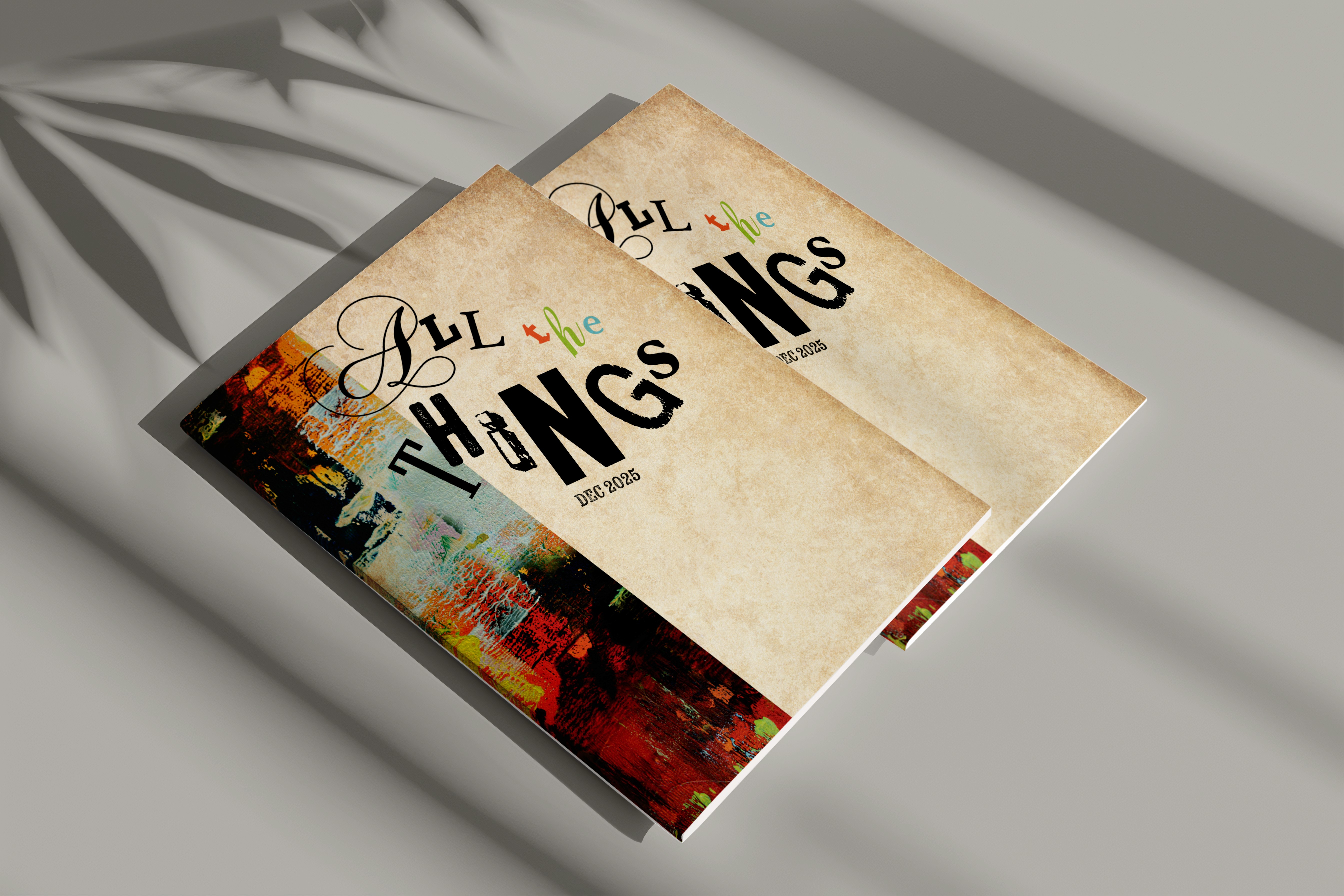
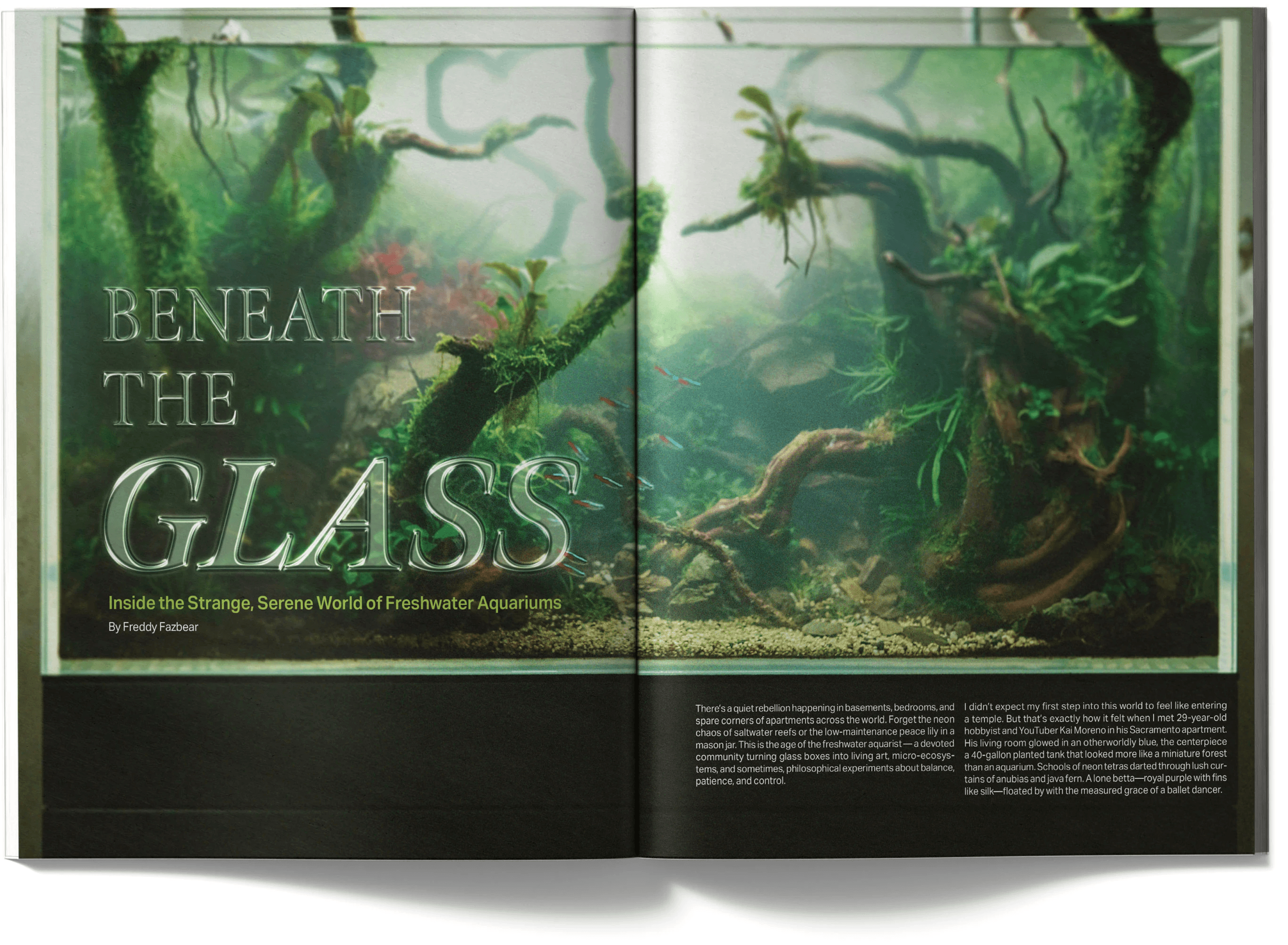
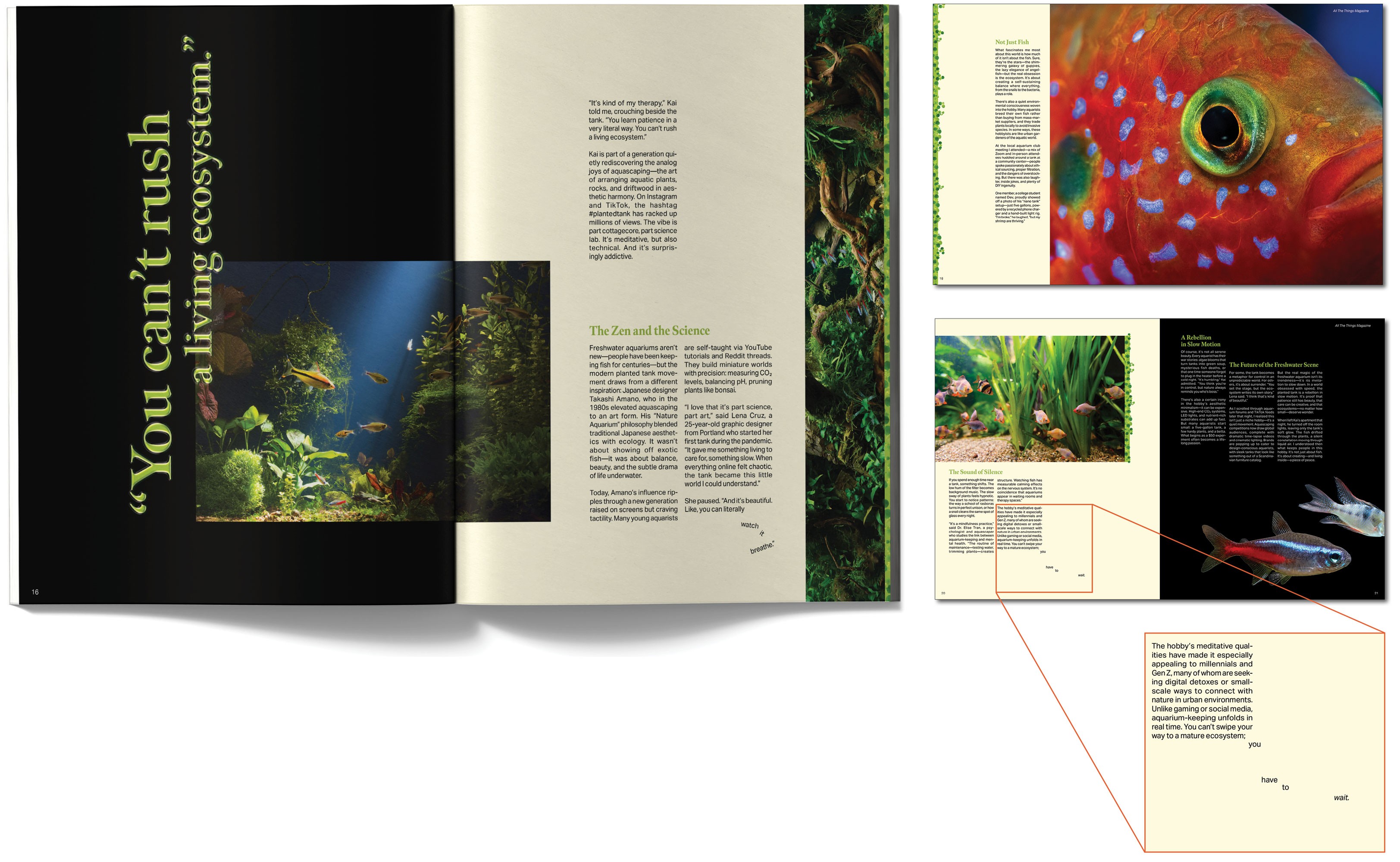
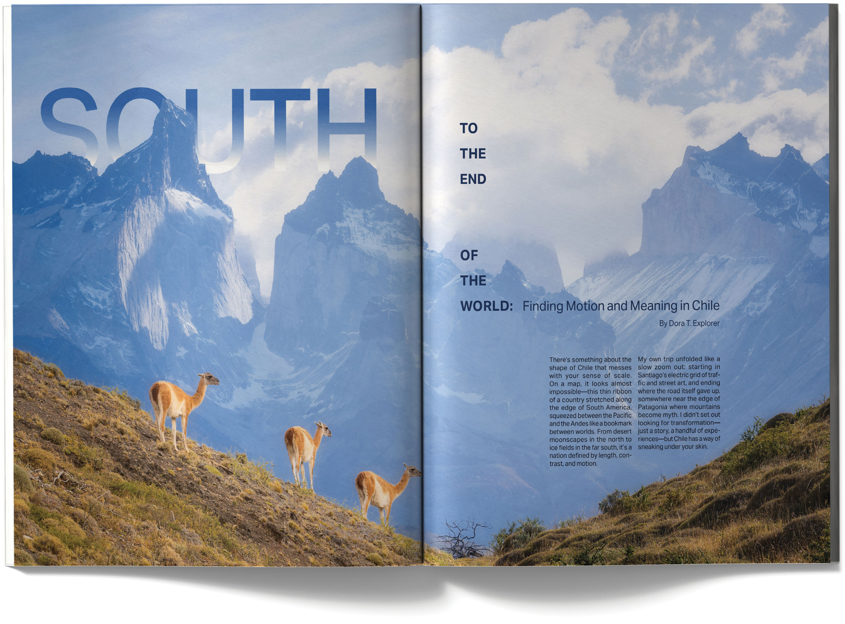
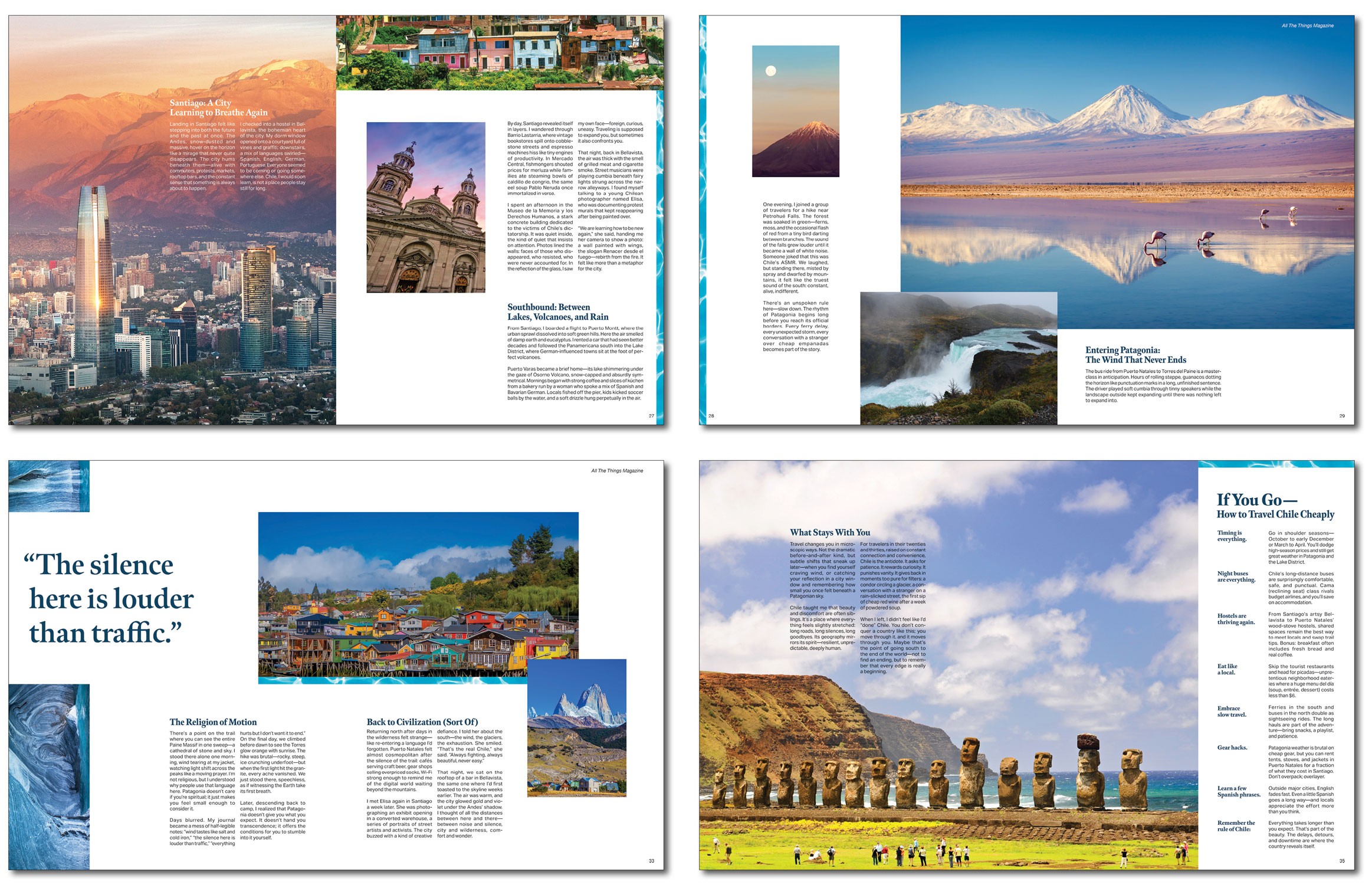
This project is a fully developed editorial magazine featuring articles on skateboarding in Sacramento, freshwater aquariums, and travel in Chile, supported by a complete system of layouts including cover, back cover, and table of contents. I designed a typographic system that organizes large volumes of content into structured, readable compositions, using hierarchy, spacing, and alignment to ensure that dense information remains engaging and visually clear. Through article-specific color coding, experimental cover treatments, and integrated advertising tailored to each audience, I created a cohesive publication that demonstrates my ability to solve complex layout challenges while maintaining strong visual identity and flow.
This project is a fully developed editorial magazine featuring articles on skateboarding in Sacramento, freshwater aquariums, and travel in Chile, supported by a complete system of layouts including cover, back cover, and table of contents. I designed a typographic system that organizes large volumes of content into structured, readable compositions, using hierarchy, spacing, and alignment to ensure that dense information remains engaging and visually clear. Through article-specific color coding, experimental cover treatments, and integrated advertising tailored to each audience, I created a cohesive publication that demonstrates my ability to solve complex layout challenges while maintaining strong visual identity and flow.
Visual System
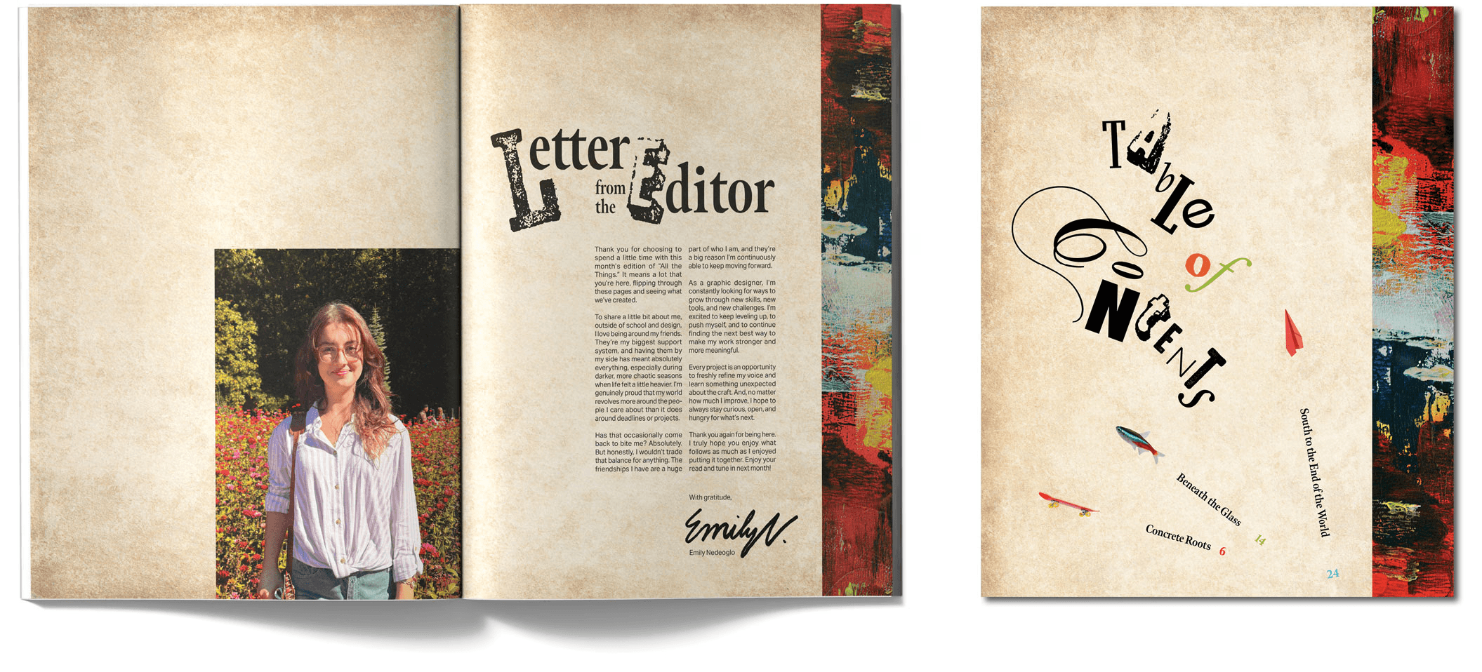
I developed a consistent visual language built around the concept of All the Things, using organically arranged letterforms of varying sizes and typefaces to create a flexible identity that encapsulates the wide range of content in the magazine. Texture and color play key roles in this system, carrying across the cover, table of contents, and letter from the editor to establish continuity. These elements act as a foundation that visually ties the publication together while allowing for variation within the interior spreads.
Visual System
I developed a consistent visual language built around the concept of All the Things, using organically arranged letterforms of varying sizes and typefaces to create a flexible identity that encapsulates the wide range of content in the magazine. Texture and color play key roles in this system, carrying across the cover, table of contents, and letter from the editor to establish continuity. These elements act as a foundation that visually ties the publication together while allowing for variation within the interior spreads.
Visual System
I developed a consistent visual language built around the concept of All the Things, using organically arranged letterforms of varying sizes and typefaces to create a flexible identity that encapsulates the wide range of content in the magazine. Texture and color play key roles in this system, carrying across the cover, table of contents, and letter from the editor to establish continuity. These elements act as a foundation that visually ties the publication together while allowing for variation within the interior spreads.
Flow and Composition
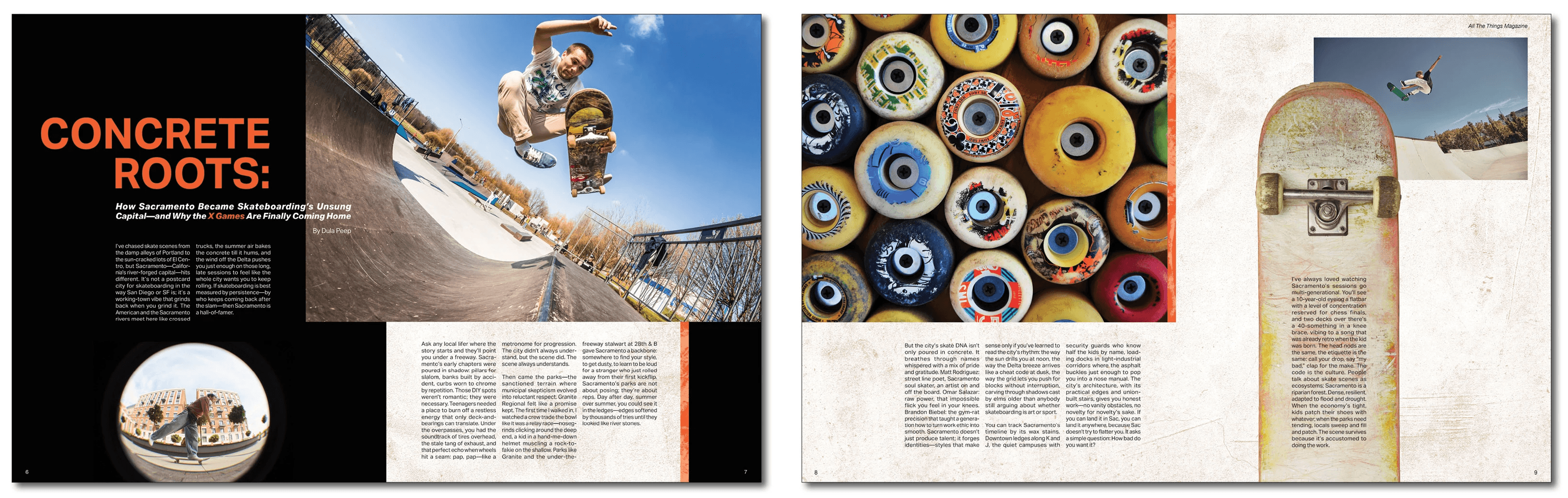
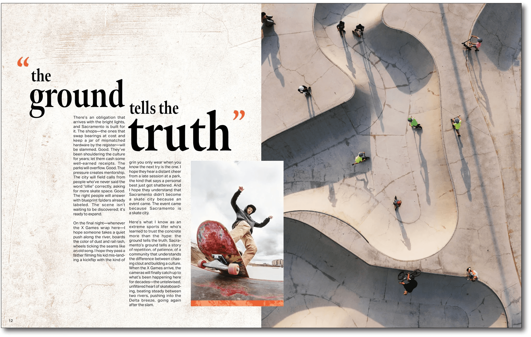
I established underlying flow lines across spreads to guide the reader’s eye and maintain movement throughout the layouts. These directional cues create a sense of continuity between pages and reinforce a dynamic composition that feels consistent.
Flow and Composition
I established underlying flow lines across spreads to guide the reader’s eye and maintain movement throughout the layouts. These directional cues create a sense of continuity between pages and reinforce a dynamic composition that feels consistent.
Flow and Composition
I established underlying flow lines across spreads to guide the reader’s eye and maintain movement throughout the layouts. These directional cues create a sense of continuity between pages and reinforce a dynamic composition that feels consistent.
Tap Through!
Tap Through!

